StepVerse - A Gamified Fitness App
A gamified fitness app designed to make fitness fun and sustainable by integrating RPG elements with daily activity.
What is StepVerse?
Click here to watch the video demo on Youtube
Imagine transforming your daily steps into an exciting adventure! StepVerse is a mobile app designed to make physical activity engaging and rewarding. It motivates users to achieve their step goals through fun gamification, personalized progression, and evolving digital characters.
🚩 Problem to Solve
Many individuals, especially those with busy schedules and sedentary jobs, find it tough to prioritize physical activity. Traditional fitness trackers or methods often feel like a chore, lacking the engagement needed for sustainable habit formation. The core problem StepVerse addresses is:
"How can we make daily movement genuinely fun and rewarding to help people increase and maintain their physical activity levels?"
🌱 Solution: Making Fitness Fun & Rewarding
StepVerse tackles this by offering an app that seamlessly tracks users’ steps while giving them full control to set personalized goals. The magic happens with a unique character that visually evolves alongside their achievements. Users are rewarded with fun accessories for their character, and they even have the option to team up with friends for a shared journey!
📊 Process: An Iterative, User-Centered Approach
This project unfolded through an iterative design cycle, always circling back to the user to ensure their needs and motivations were at the forefront. Starting with foundational research, I focused on creating regular touchpoints for feedback, allowing the design to adapt and improve at every stage.
🤔 Initial Hypotheses
To guide the initial design direction, I formulated a few key hypotheses:
- Step Tracking and Goals: “We believe that by enabling users to set personalized daily step count goals and track their progress, we will achieve an average daily app usage time of 15 minutes and a daily step goal completion rate of 40% among users.”
- Personalized Characters: “We believe that by allowing users to create and customize characters that visually evolve as they achieve step goals, we will increase user engagement, measured by an average session length of 5 minutes.”
📈 Market & Competitor Analysis
I jumped into Market Research to find a common goal that is beginner friendly.
Most common fitness goals - Survey in the US Jan 2024:
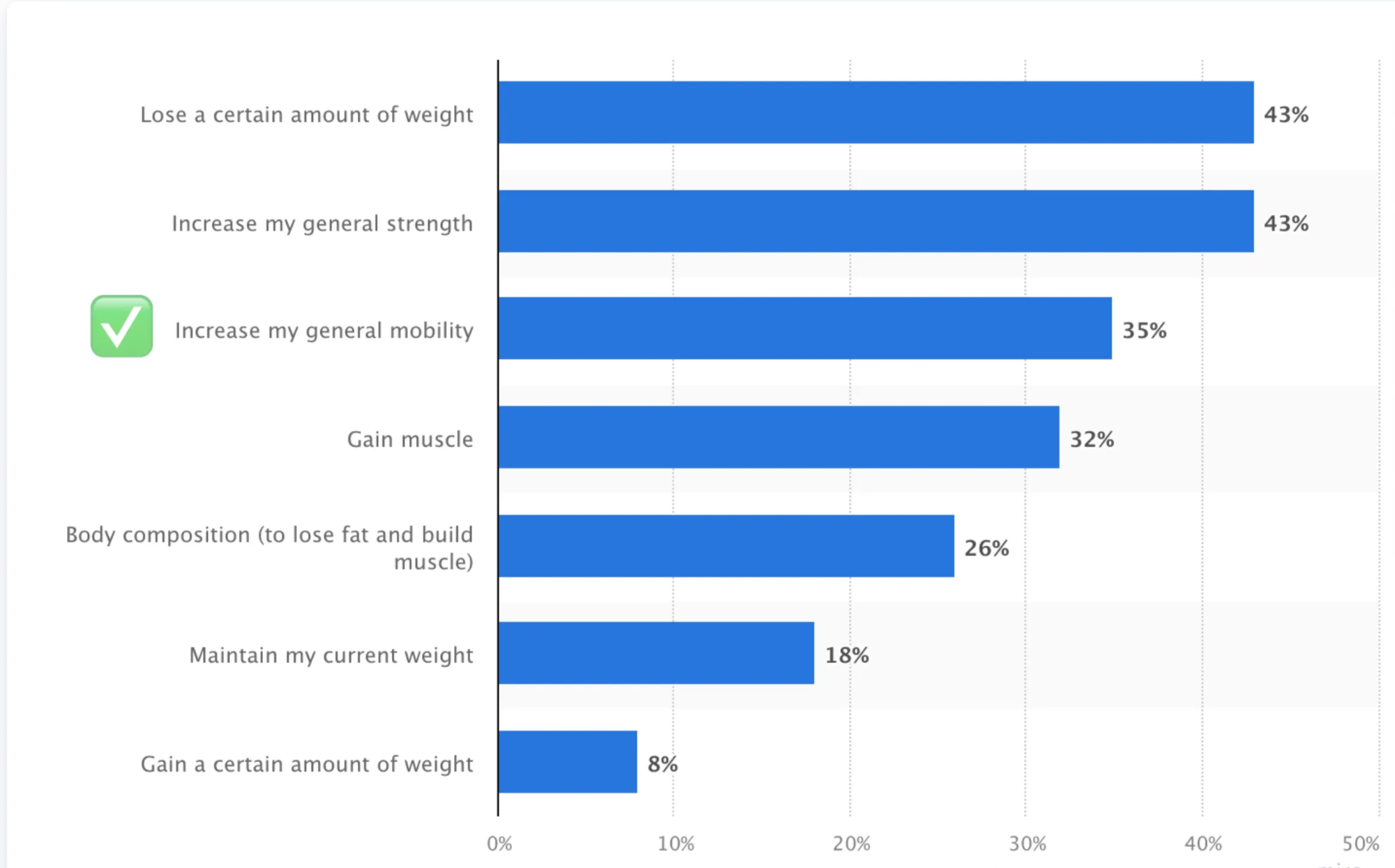
Market Insights: Research (US Survey, Jan 2024) revealed that “general mobility” is a primary fitness goal. This validated the choice of “step count” as a simple, beginner-friendly metric to encourage daily movement.
While listing out the problems users face, I did not want to use Competition as the main motivator, but wanted to still have a sense of Community.
As the app should focus on a change in user behavior, my research took me to Fogg’s Behavior model, which uses Motivation, Ability, and the right Triggers to apply a change of behavior.
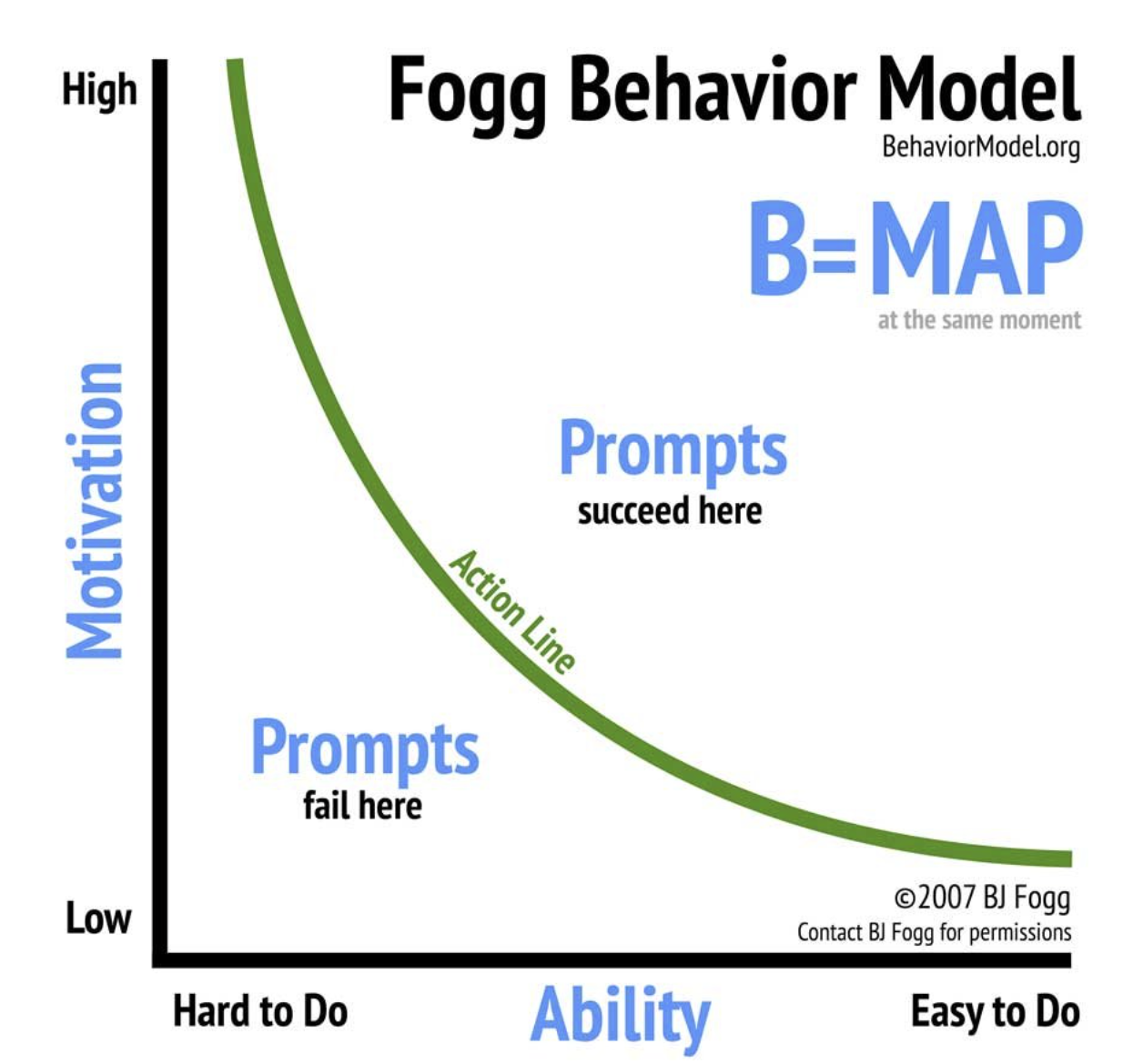
Applying this to StepVerse:
- Motivation: Driven by character progression, unlocking rewards, and a sense of achievement.
- Ability: Empowered by user-set goals, with the intrinsic motivation that higher step counts lead to faster progression.
- Triggers: StepVerse itself acts as a trigger through reminders, progress visualization, and celebrating achievements.
Competitor Analysis:
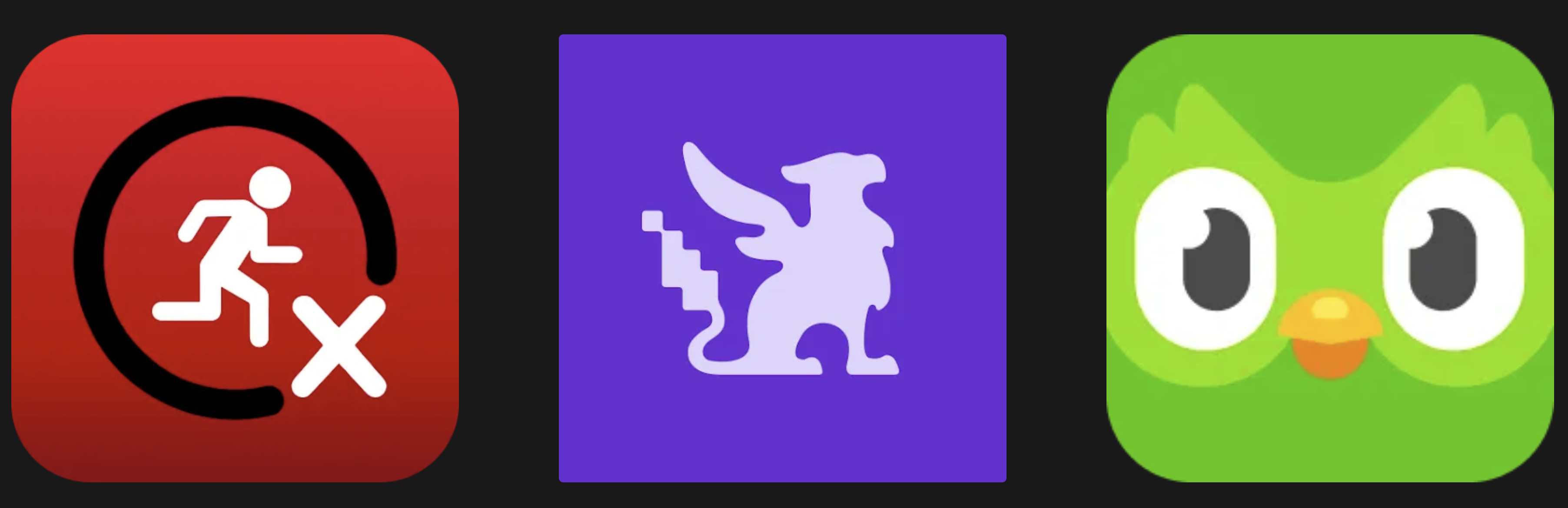
I analyzed apps like ZRX (Zombies Run, Marvel Move) and Habitica for their overall strategy, UX, and gamification techniques. Duolingo also served as a key inspiration for its effective gamification.
Key Takeaways from Competitors:
- Narrative and storytelling (ZRX) can significantly boost engagement.
- Clear progression and tangible rewards (Habitica, Duolingo) are crucial for motivation.
- While competition can be a motivator, StepVerse aims for a more personal and supportive community feel, learning from how others manage social features.
🕵🏻 Hearing from Users: Research & Discovery
To ensure StepVerse truly resonated with potential users, I employed a mix of user surveys and in-depth interviews.
Research Goals:
- Uncover motivations and barriers related to daily physical activity.
- Identify gamification elements that effectively encourage consistent engagement.
- Determine preferences for avatar design, reward systems, and social interactions.
- Understand past experiences with habit formation.
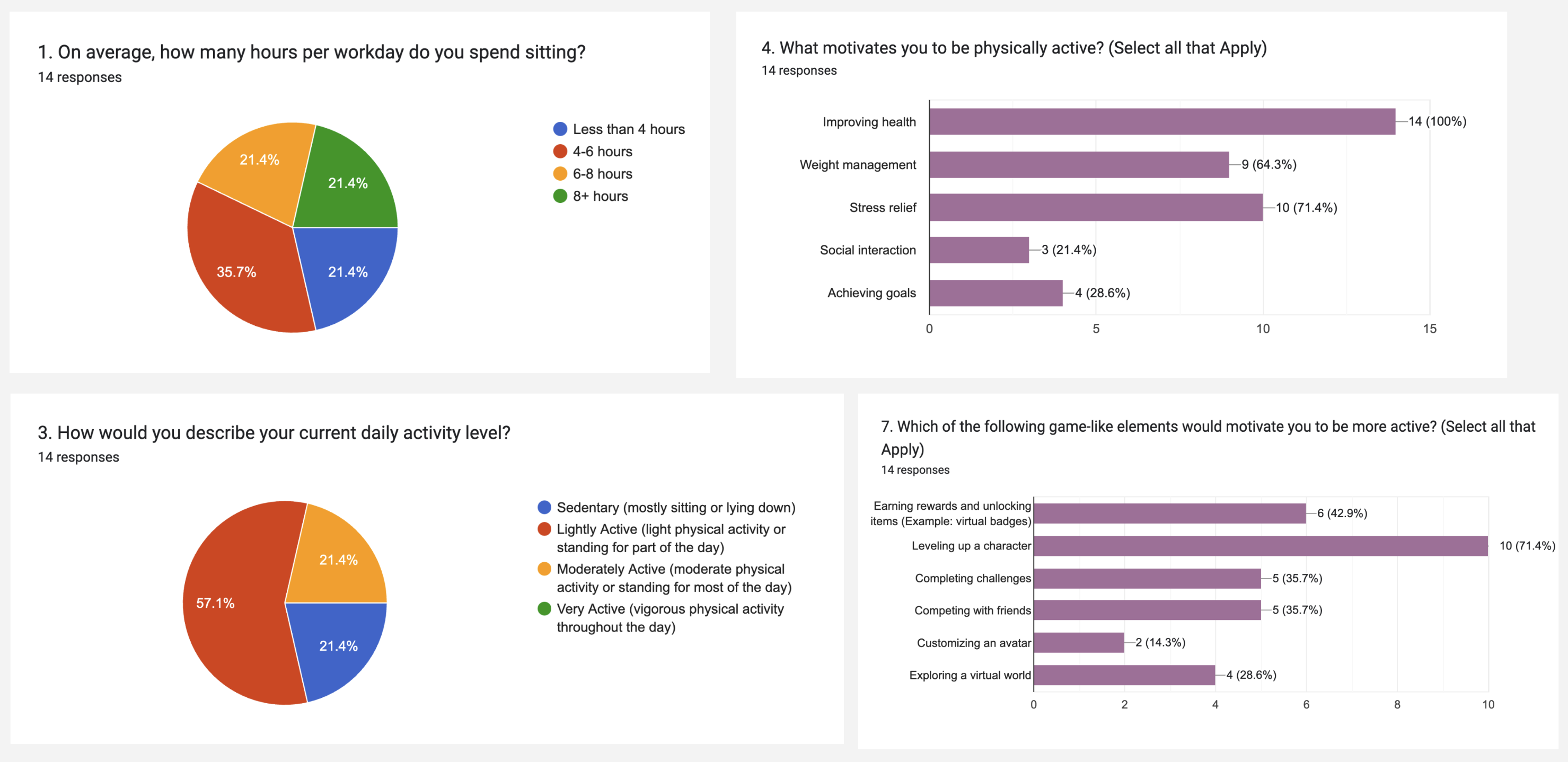
Survey Results:
Key Takeaways from Interviews:
- Social Connection is Key: Strong interest in social features or linking activity to real-life events, suggesting even a simple team feature would be valuable for MVP.
- Character as a Companion: Users envisioned the character as a workout partner, offering a unique angle for app positioning and communication.
- Level-Up Appeal: The concept of character progression and leveling up was highly motivating and validated its place as a core feature.
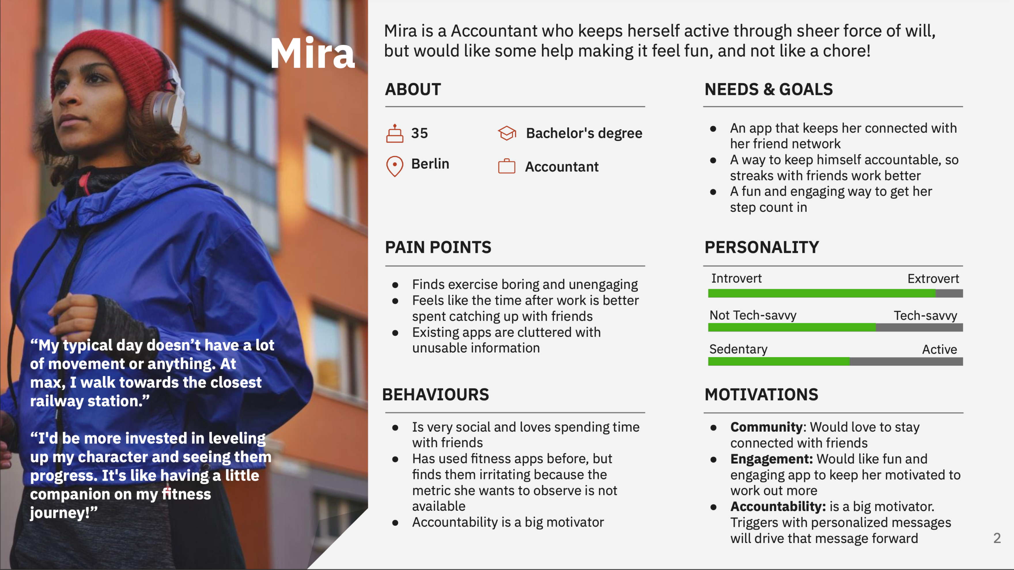
🫅🏻 Meet the StepVerse Users: Personas
Based on the research, I developed user personas to embody the needs and motivations of our target audience, helping to guide design decisions with empathy:
Mira: A dedicated accountant who maintains her activity through willpower but seeks a more enjoyable and less chore-like fitness experience.
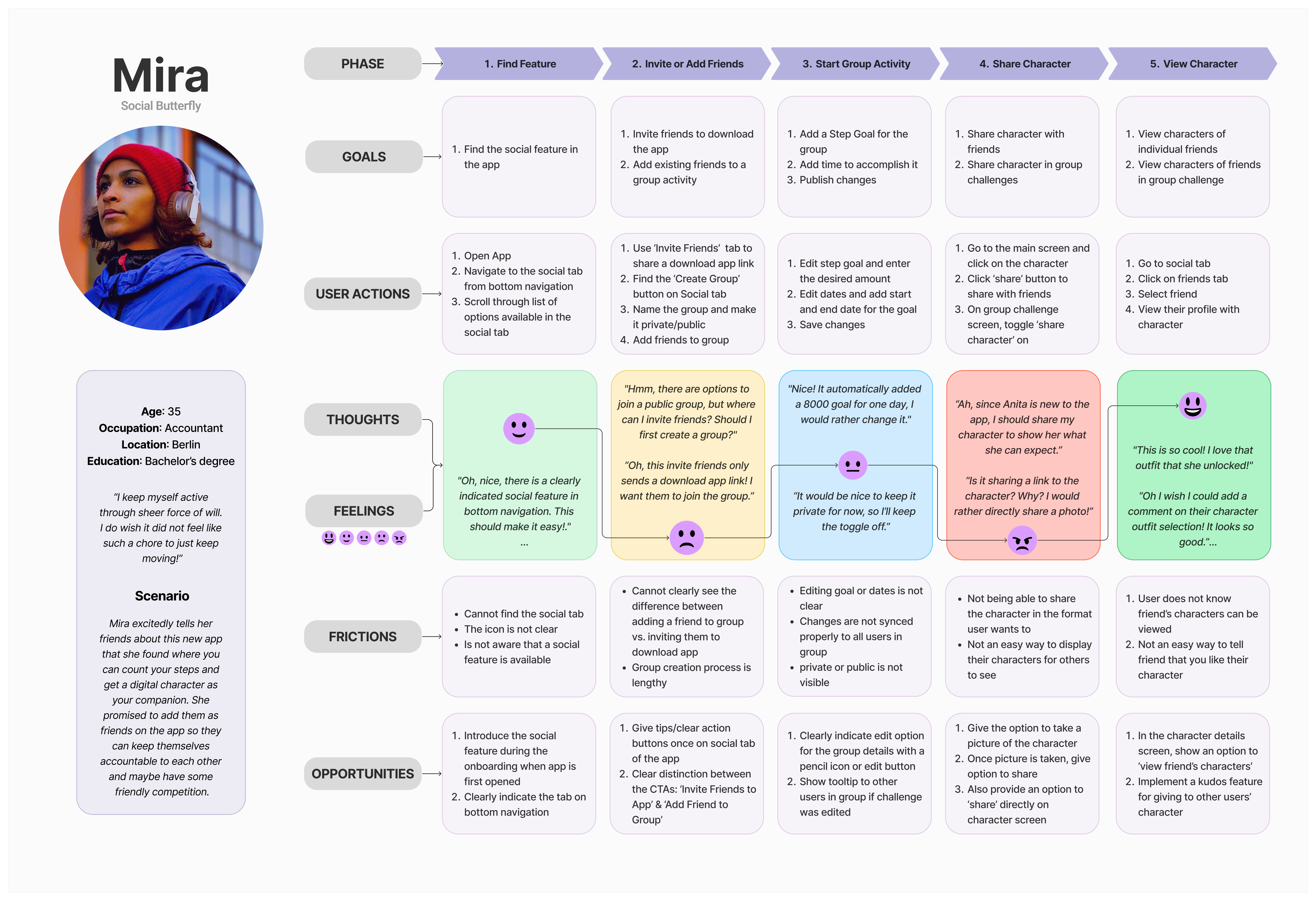
🗺️ Walking in Their Shoes: User Journey Maps
To visualize the user’s experience with StepVerse and identify potential pain points or opportunities for delight, I created journey maps for Mira and Tony, focusing on key interactions:
Mira’s Journey Highlights: Adding social features, sharable characters, and options to encourage friends
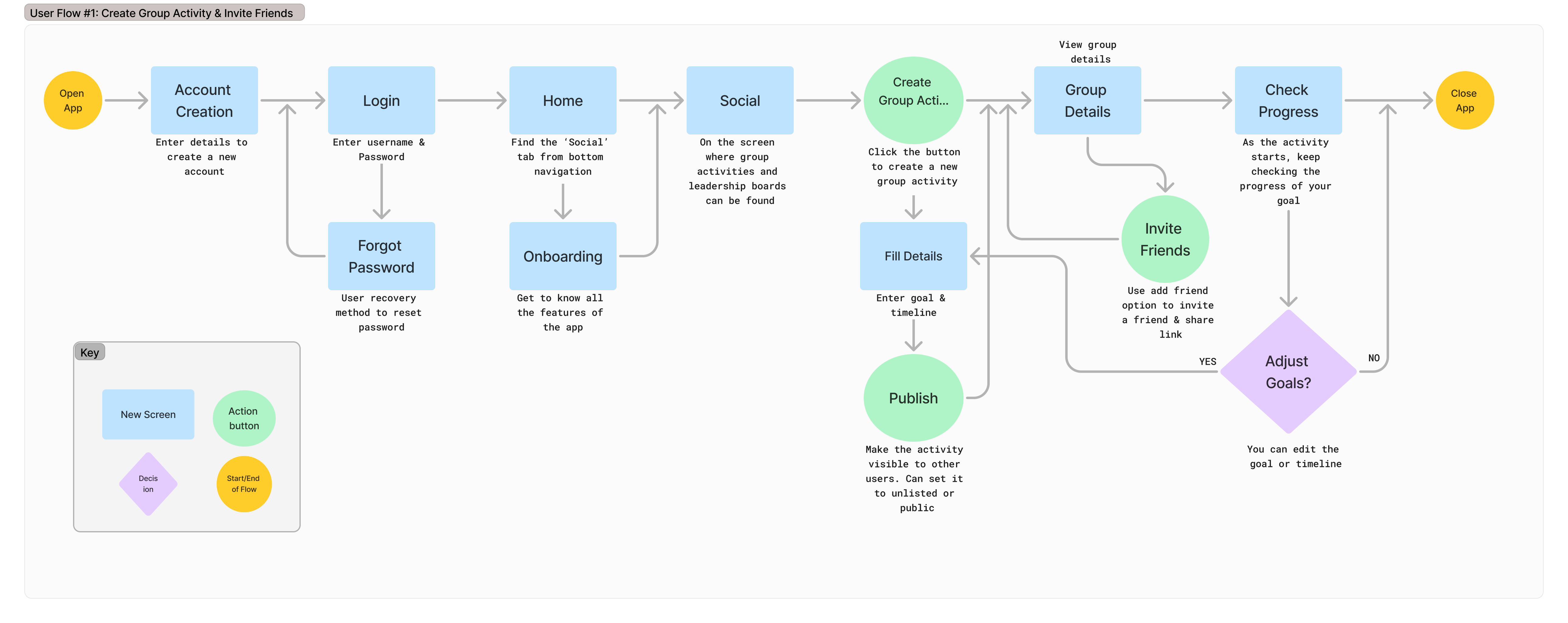
🌊 User Flows
With a clearer understanding of our users and their journeys, I mapped out key user flows to define the interaction pathways within the app, ensuring a logical and intuitive experience:
Mira would like to Create a Group Activity and Invite Friends
📐 Wireframes & Early Designs
The design process moved from broad strokes to detailed layouts, starting with foundational structures.
Initial Sketches (Low-Fidelity):
Early explorations focused on core screen layouts and navigation. (It was pen on paper and I loved the process as an illustrator myself! 👩🏻🎨)
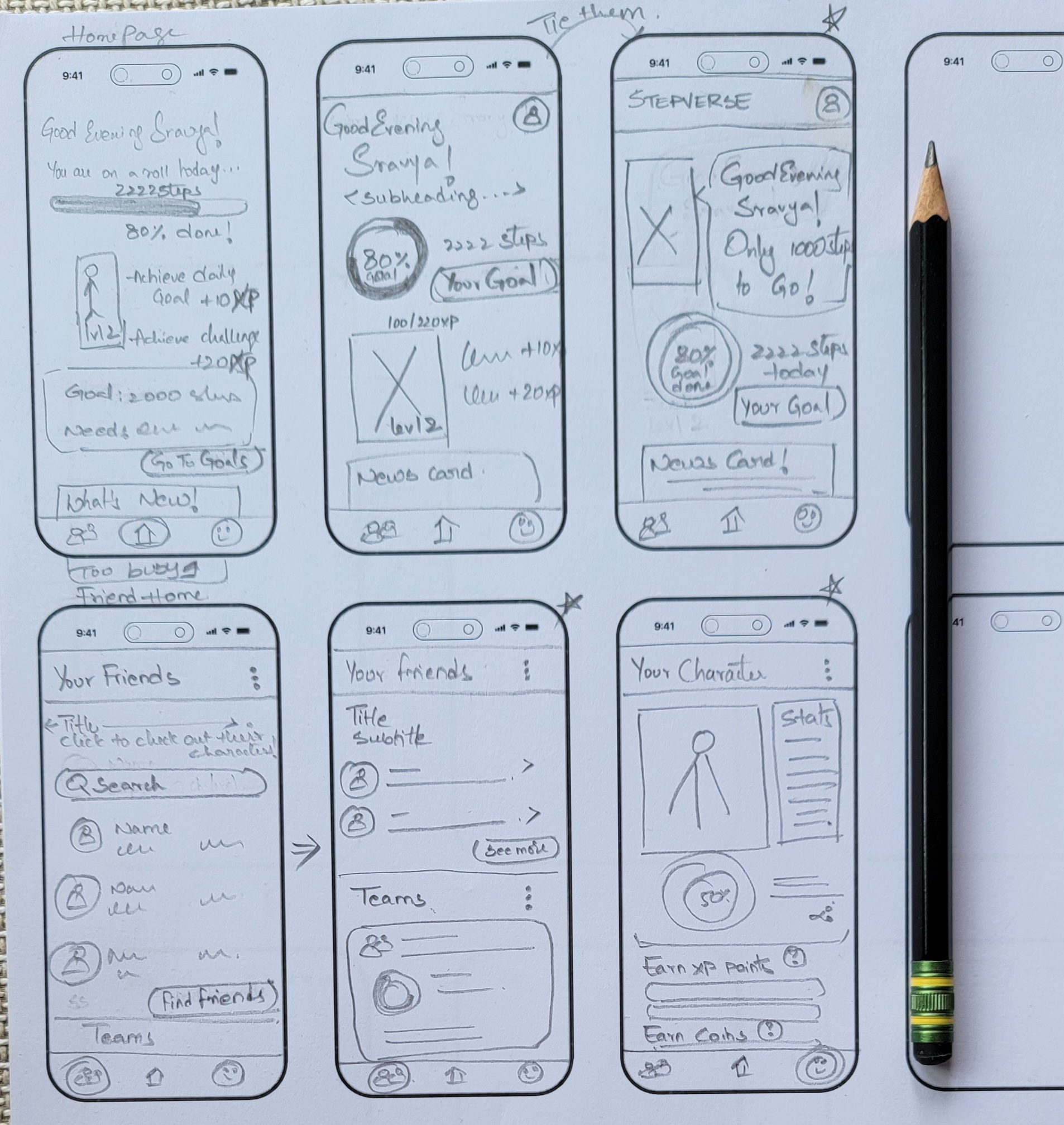
I tried to design a way that ties core themes of StepVerse together, without also overwhelming the user with too much information.
Design System
Lean Design System for scaling and consistency across systems
To keep StepVerse consistent as the product grew, I created a lightweight design system with foundations, reusable components, and shared UI patterns. This helped bring more structure to the interface and made repeated elements easier to design and reuse. The system is also being refined further through Figma variables for more scalable color management.
Foundations
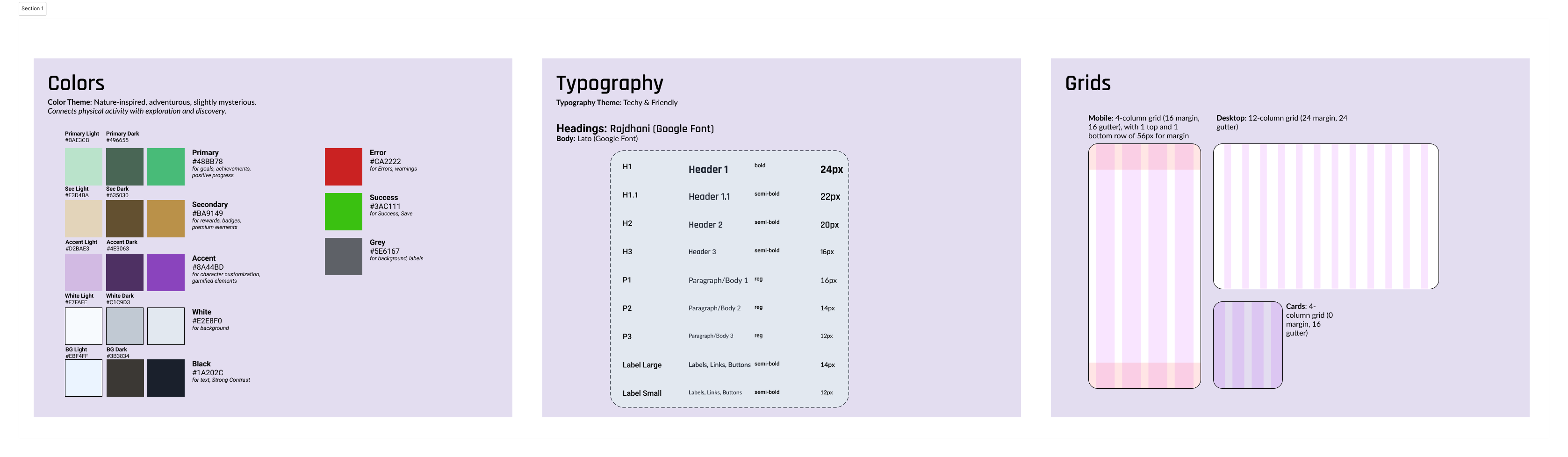
I defined the visual foundations of the system through color and typography styles that matched the tone of the app. These foundations created a clear base for the rest of the interface and supported consistency across screens.
Future plan: introduce variable modes for light and dark themes.
Components
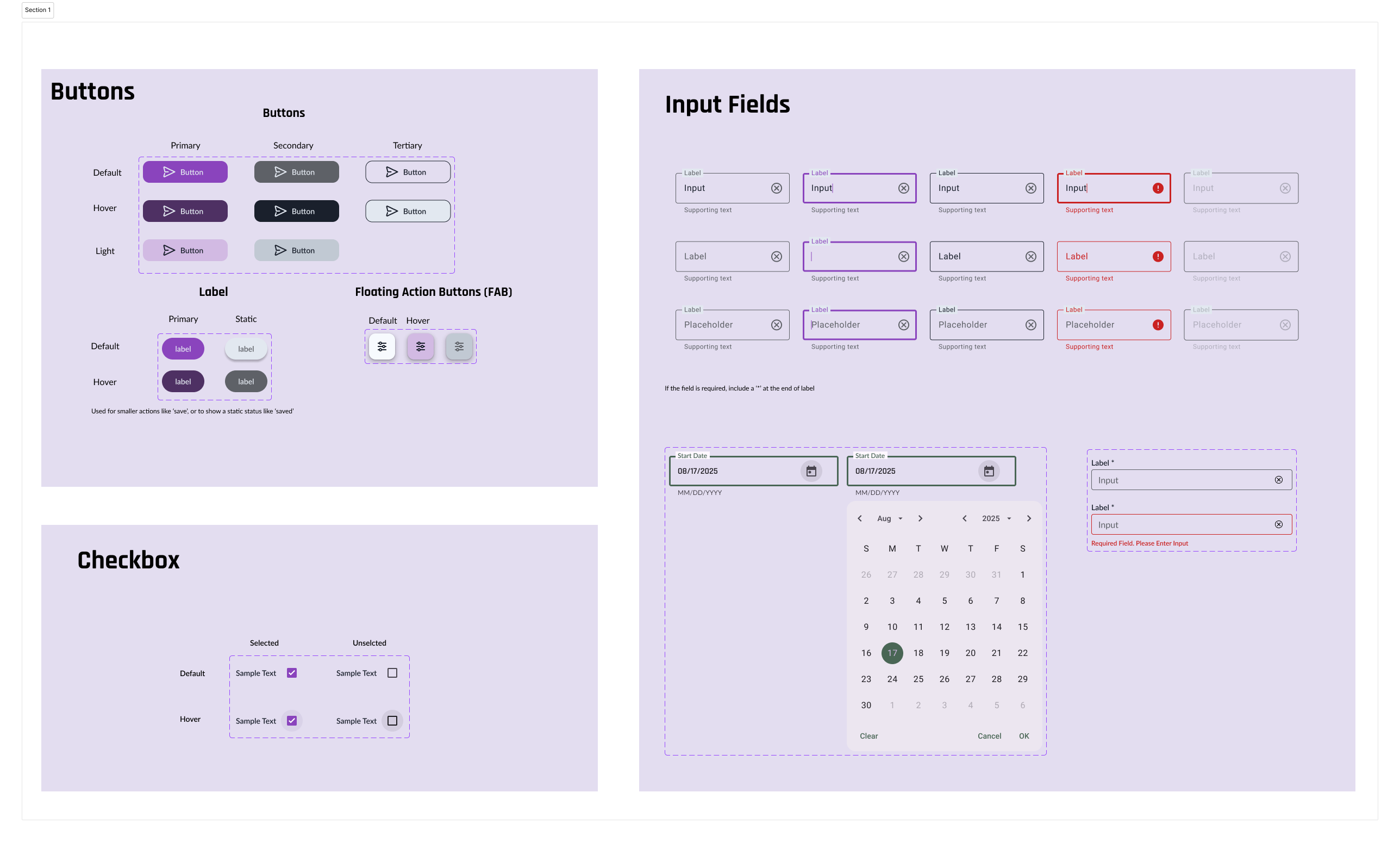
Using these foundations, I built core components such as buttons, input fields, and checkboxes. These were designed with key states in mind so they could be reused across the product with more consistency and less rework.
Particular attention was given to interaction states such as default, focus, error, and empty states.
Patterns
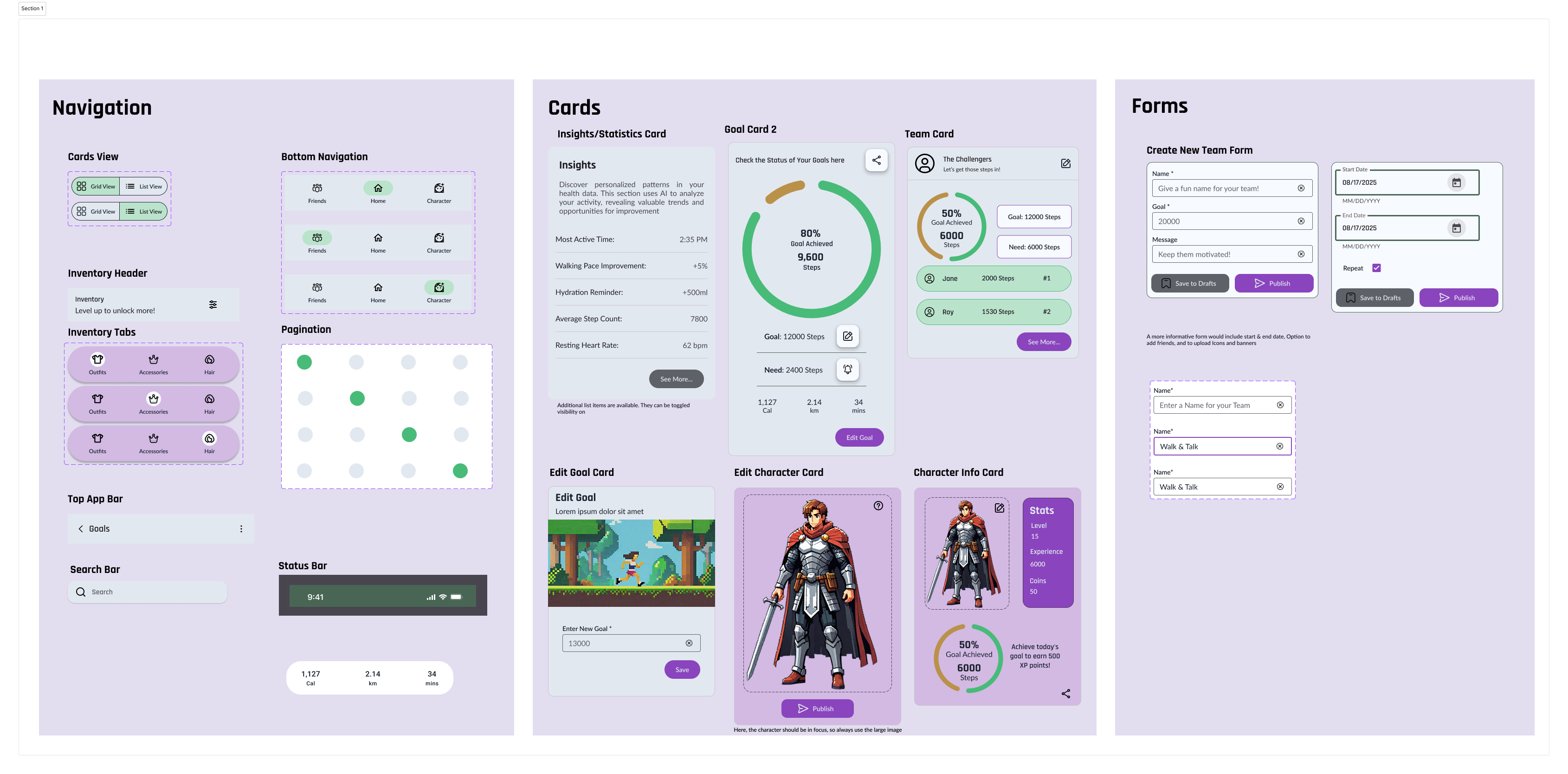
I then extended these building blocks into larger UI patterns such as cards, forms, and navigation. The goal was to create patterns that felt familiar and easy to use, while still fitting the visual identity of StepVerse.
To move efficiently, I used existing Figma libraries where appropriate. Material Design 3 components were used as a starting point for some elements, then adapted to match StepVerse’s visual style and specific use cases.
Initial High-Fidelity Wireframes (Version 1):
These brought the low-fidelity structures to life with more detailed UI elements, initial color considerations, and content placement, preparing the design for usability testing.
With these versions built into an interactive prototype in Figma, I went into Usability testing, followed by multiple design iterations with respect to Accessibility, Material Design Guidelines etc. Looking back at these initial designs further proves the importance of constant feedback and iterations.
🧪 Usability Testing
To validate design decisions and uncover usability issues early, I conducted moderated remote usability testing with 6 participants via Google Meet.
→ Purpose: Gather feedback on the design and functionality of StepVerse to identify areas for improvement and ensure a user-friendly, engaging experience.
→ Key Test Objectives:
- Onboarding & Login: Ease of completion and understanding core features.
- Edit Goal: Locating and successfully editing step goals.
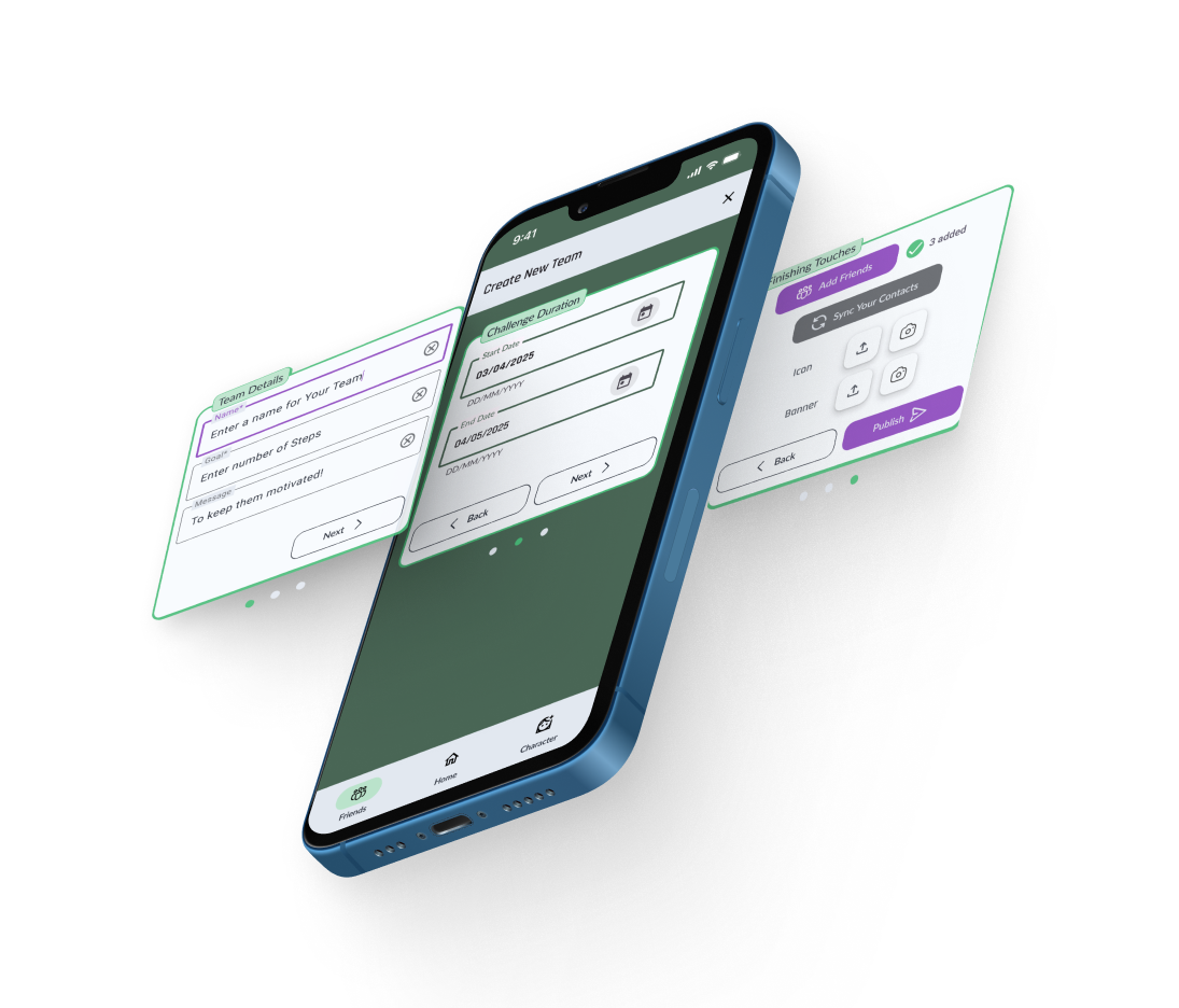
- Create New Team: Ability to find the feature and creating a team.
- Edit Character: Locating the feature and understanding the link between upgrades and achievements.
Once done with the interviews, I analyzed them with respect to body language, hesitation, what they said vs. what they did etc. I mapped the behaviors in an affinity map to group the findings better.
Affinity Map of Usability Tests with 6 Participants P1 to P6
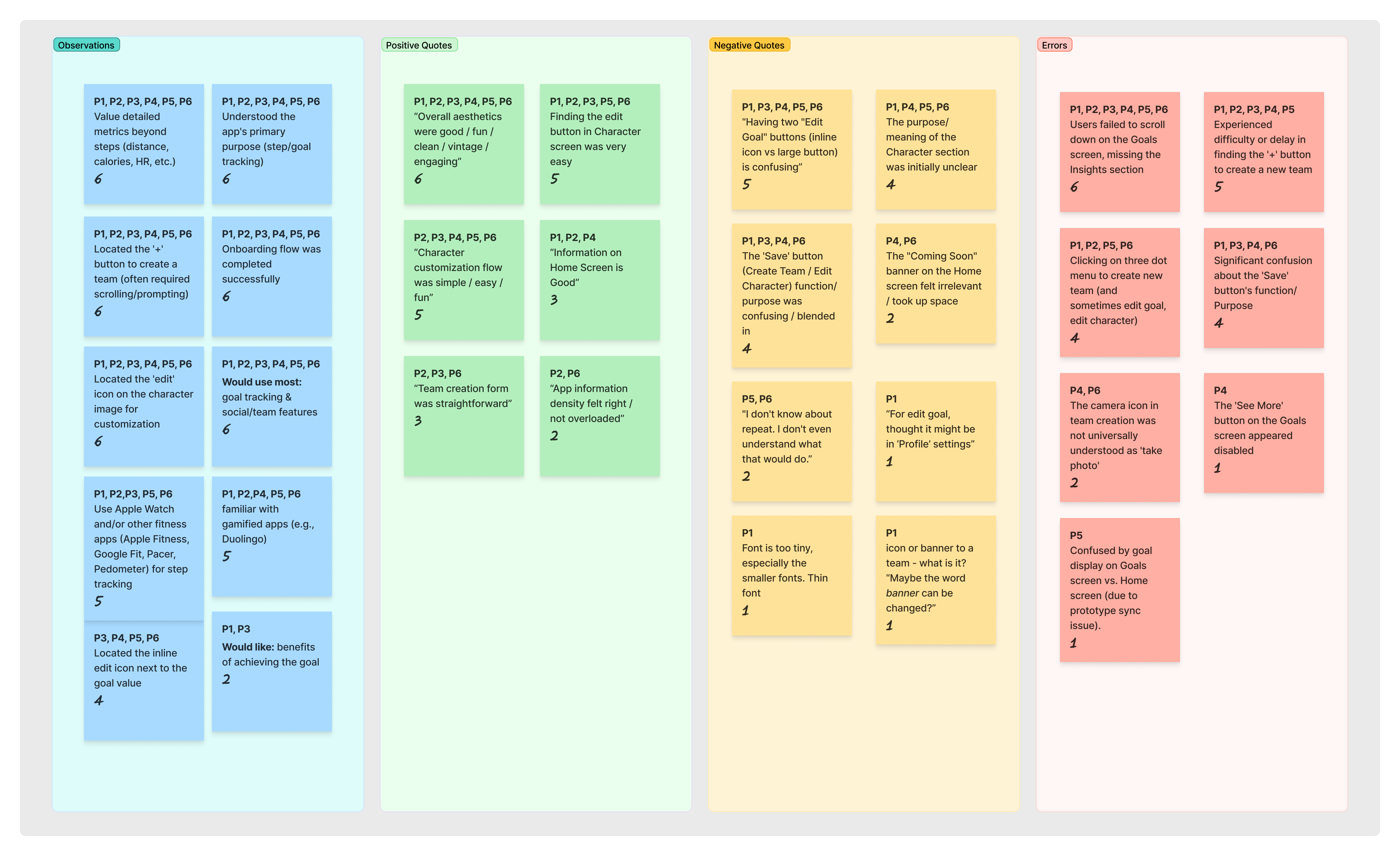
Key Findings:
With the findings from Affinity Map filtered in a Rainbow Spreadsheet, I found 5 priority issues that are actionable.
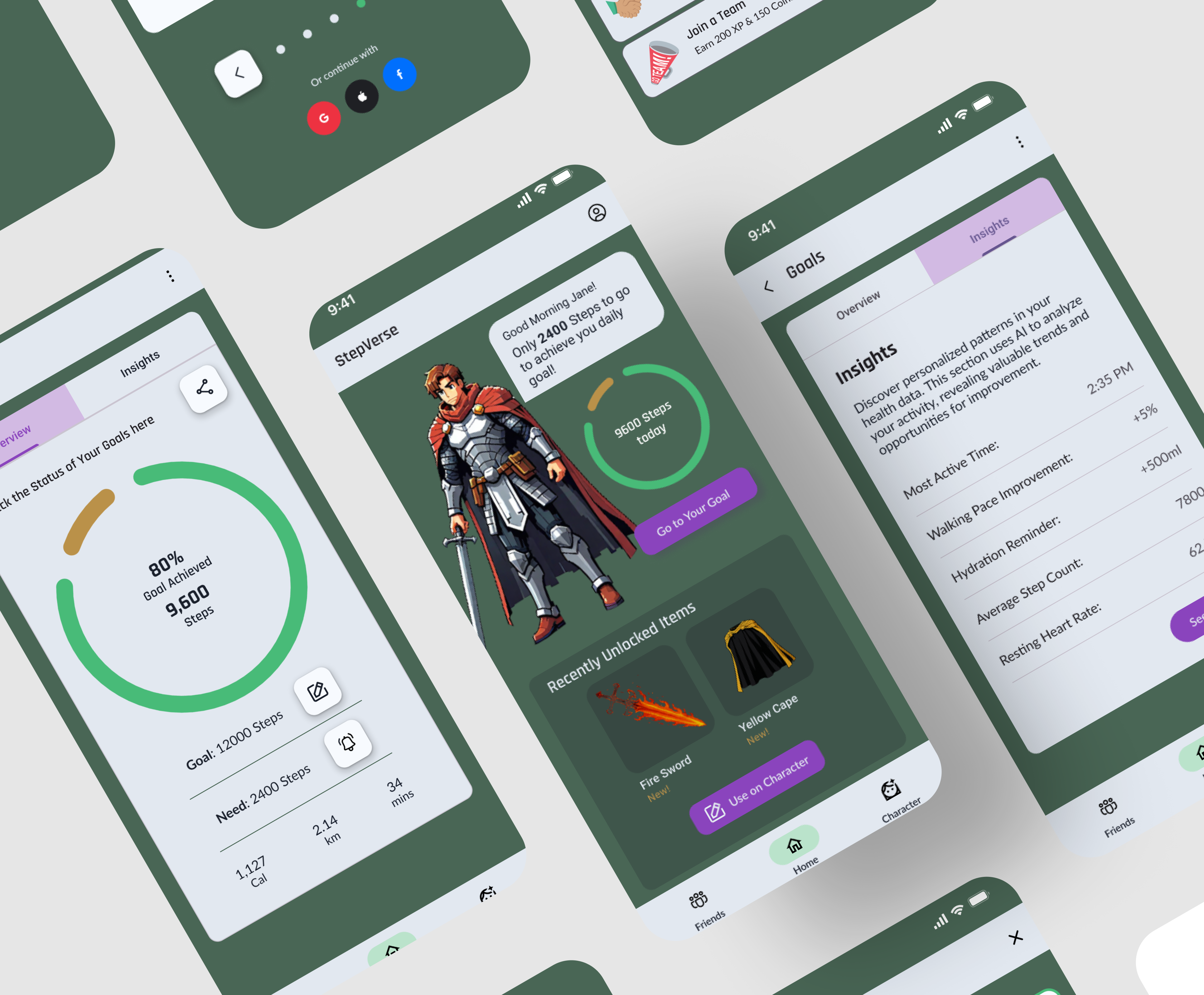
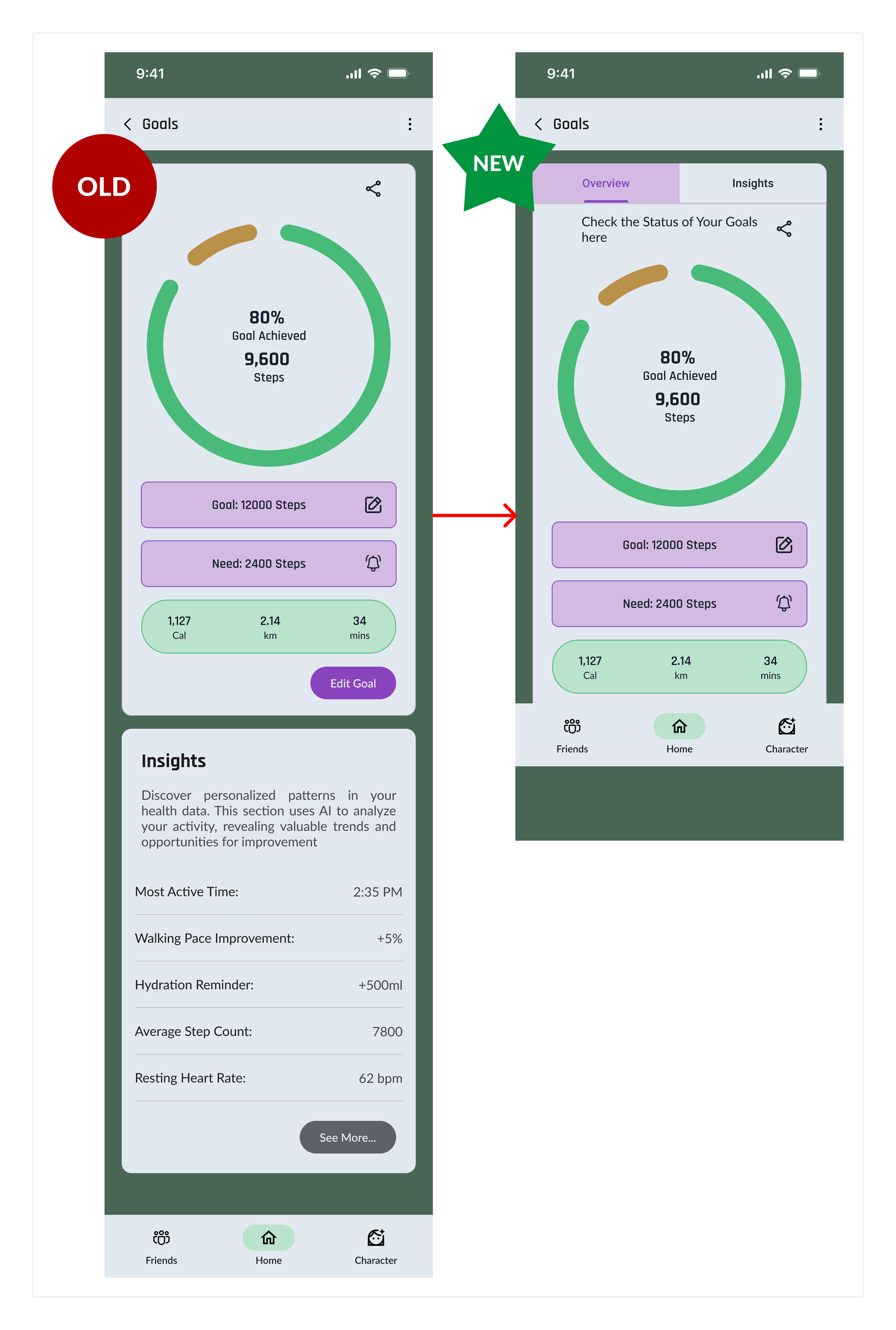
- Insights Hidden (Severity 4 - Catastrophe): Users consistently missed the scrollable “Insights” section on the Goals screen.
- Team Creation Difficulty (Severity 3 - Major): Users struggled or were delayed in finding the ’+’ button to initiate team creation.
- Character Section Unclear (Severity 3 - Major): The initial purpose and value of the “Character” section weren’t immediately obvious to all.
- Menu Confusion (Severity 3 - Major): The three-dot menu was sometimes mistakenly clicked when users intended to create or edit items.
- ‘Save’ Button Ambiguity (Severity 2 - Minor): Some confusion regarding the ‘Save’ button’s immediate effect in “Create Team” and “Edit Character” (vs. a “Publish” or “Done”).
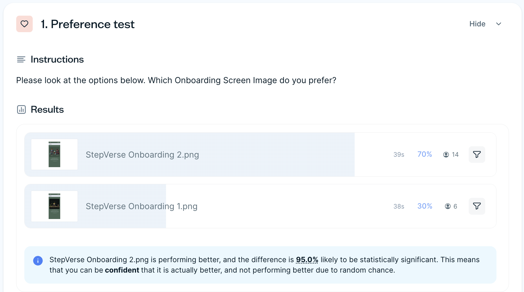
Preference Tests
Additionally, I also conducted preference tests to find which images for onboarding resonated with users more.
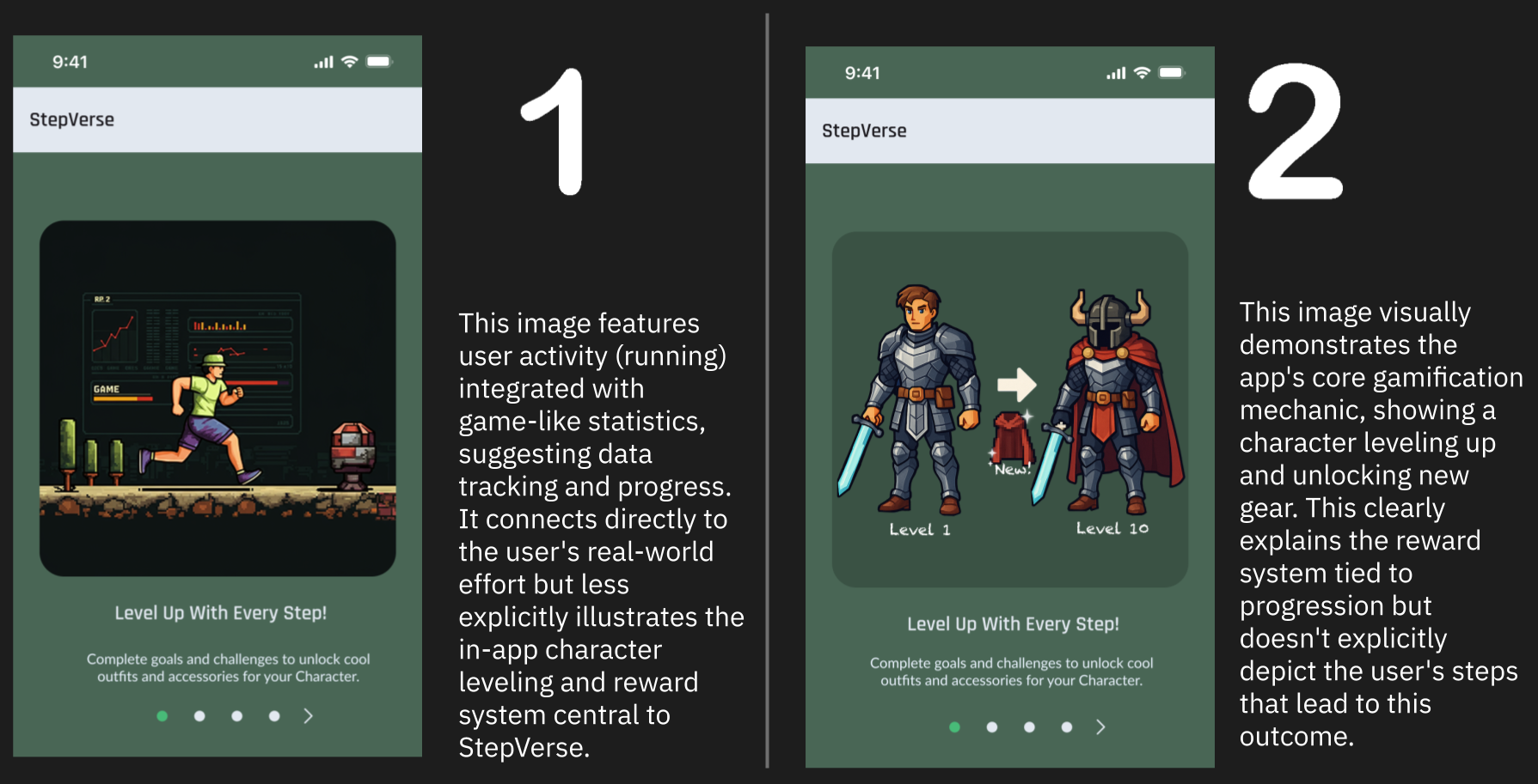
70% of users chose the second onboarding screen, making it 95% likely to be statistically significant.
🔁 Design Iterations
Based on usability testing insights and valuable peer feedback, several key iterations were made to enhance usability and accessibility.
Post-Usability Testing Iterations
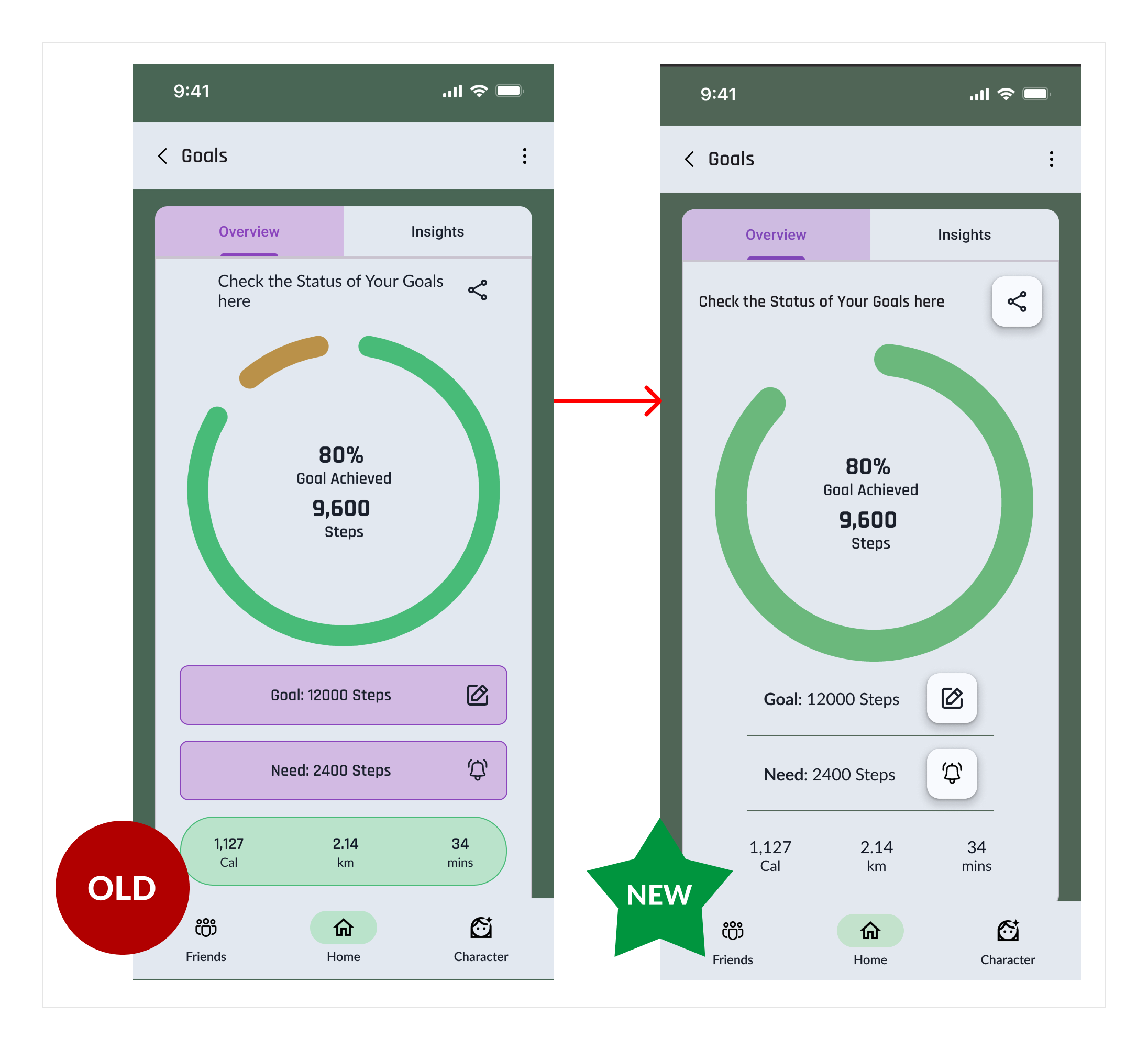
- Making sure the discoverability of the Insights section, which is an important feature, remain easy and visible.
Accessibility Iterations
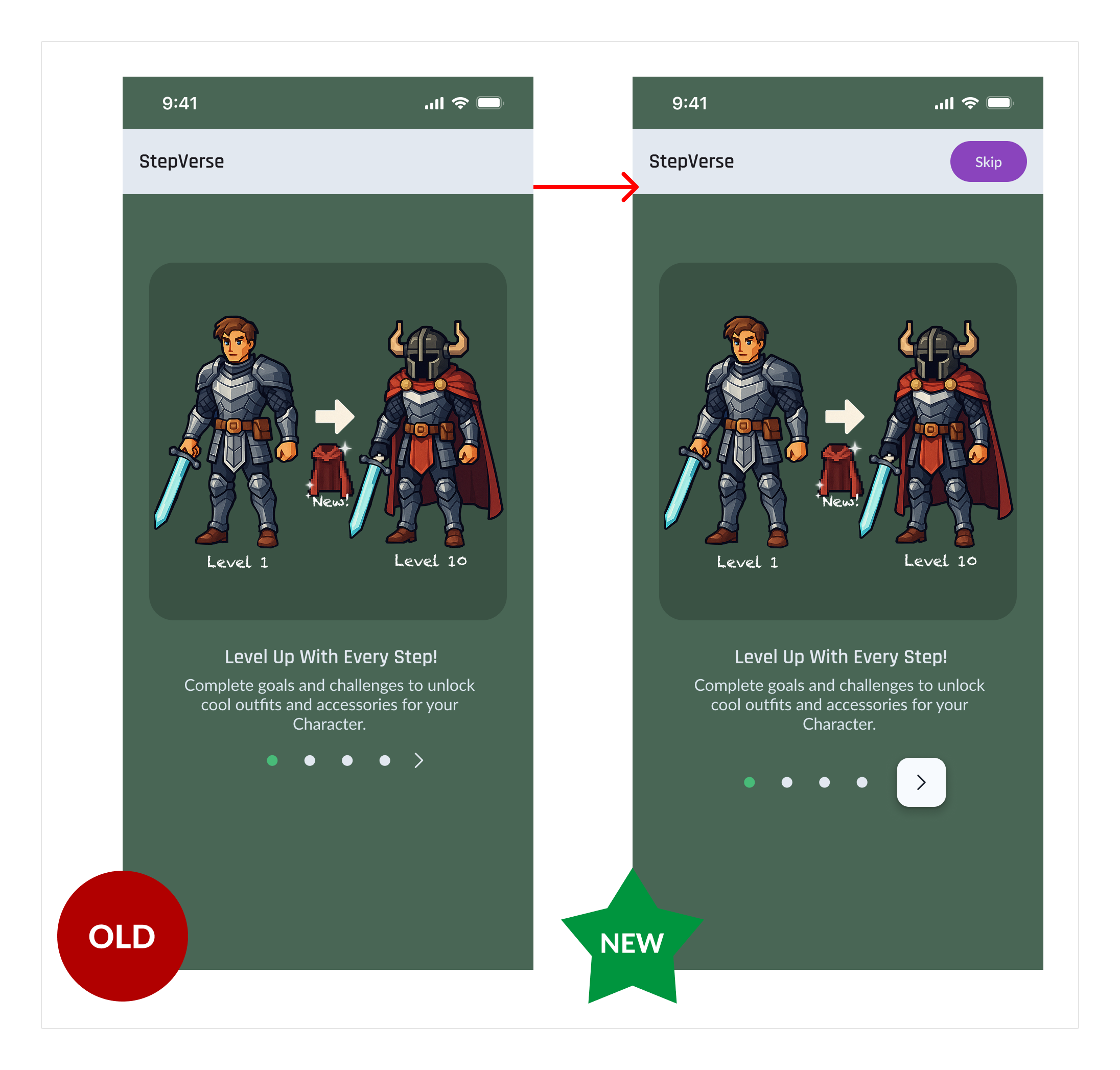
- WCAG 2.4.1 (Skip Blocks): Implemented clearer methods to bypass repeated navigation blocks, improving keyboard navigation.
- Clickable Affordances: Ensured elements within the Goals card (like the edit icon) had clear visual cues indicating they were interactive.
Peer-feedback Iterations
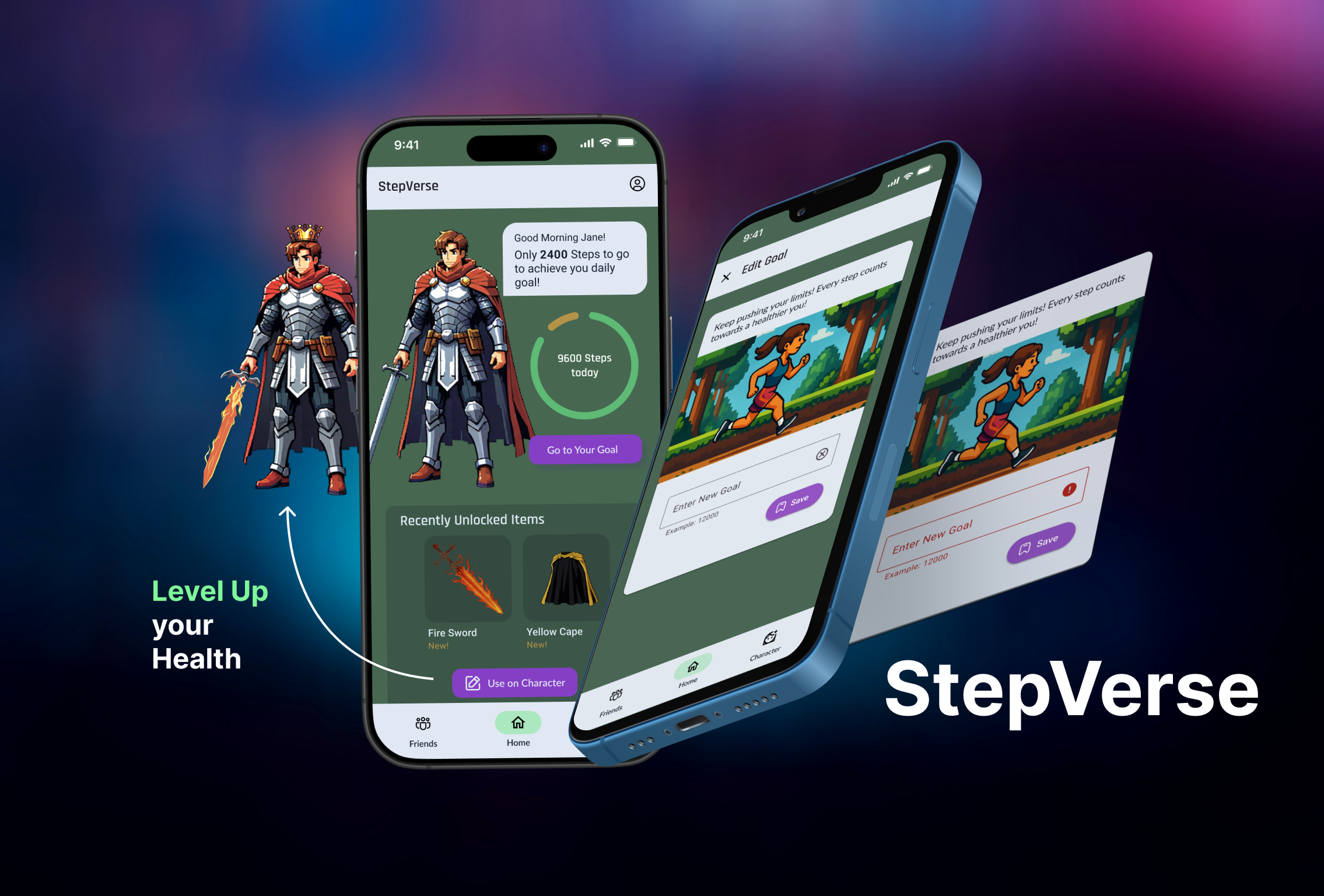
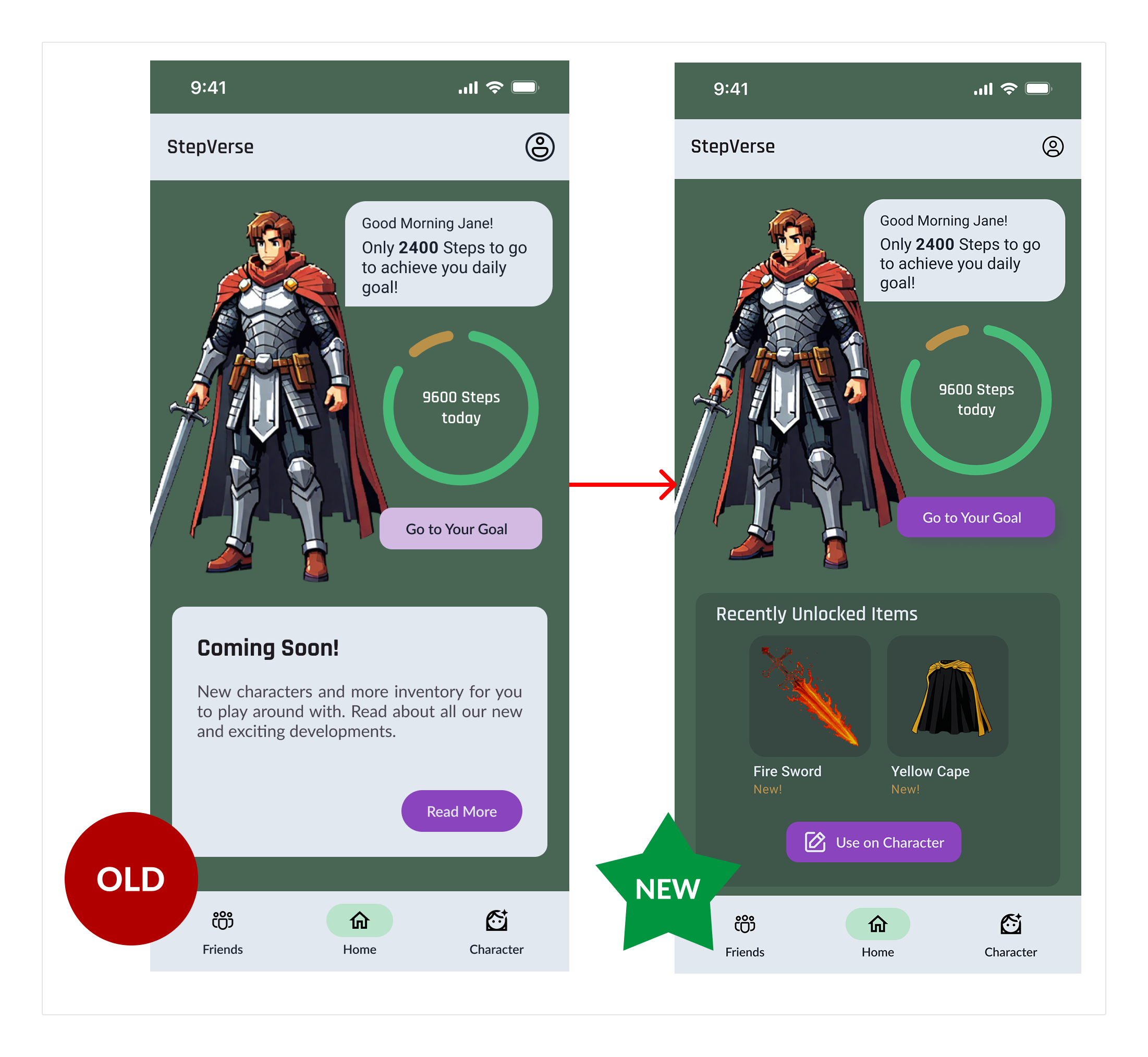
- Engaging Home Screen: Replaced placeholder “Coming Soon” content with a “Recently Unlocked” items section, featuring a direct “Use on Character” CTA.
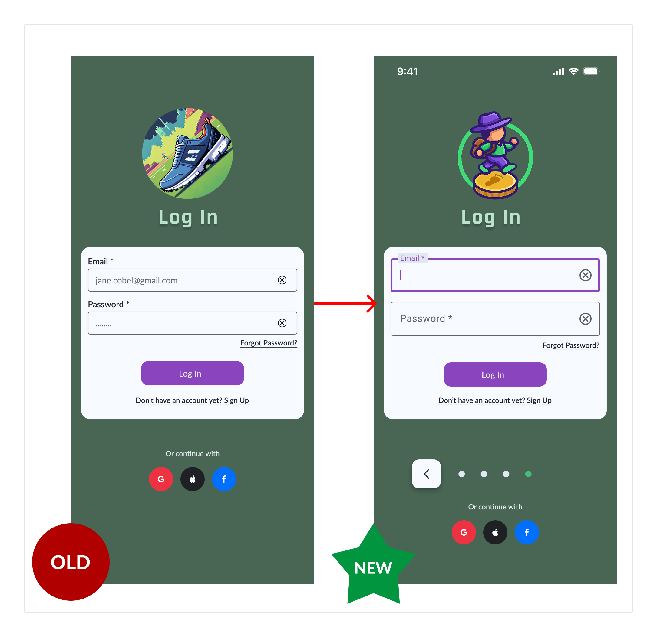
- Improved Input Fields: Adjusted login input field height for better visual balance and alignment with Material Design 3 guidelines.
🎨 Style Guide: Defining the Visual Language
To ensure visual consistency, a cohesive brand identity, and efficient development, a style guide was established for StepVerse. It outlines color palettes, typography, button styles, iconography, and other core UI components.
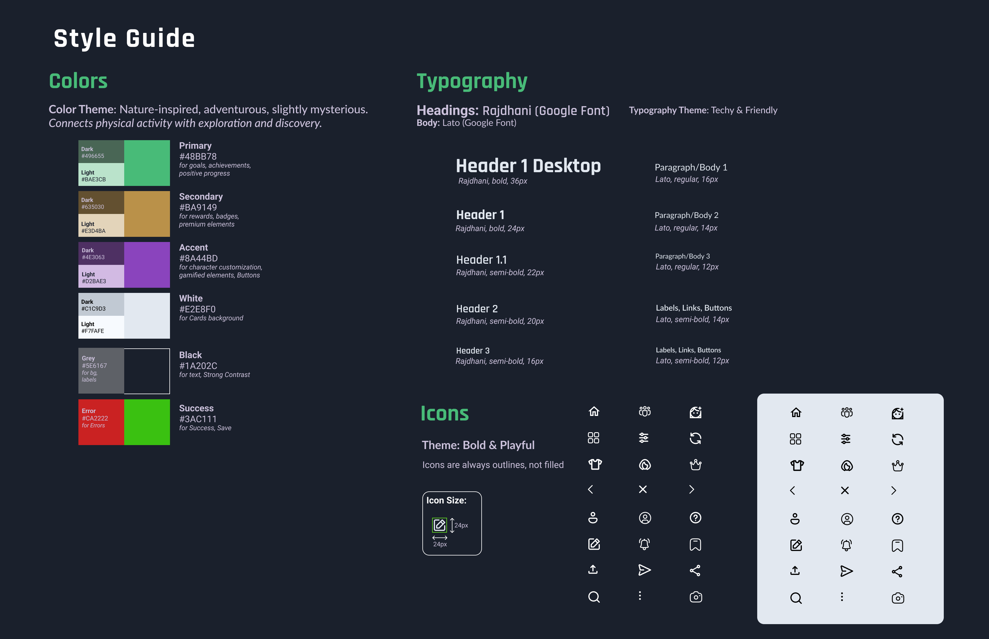
🔗 Click here to view the full StepVerse Style Guide
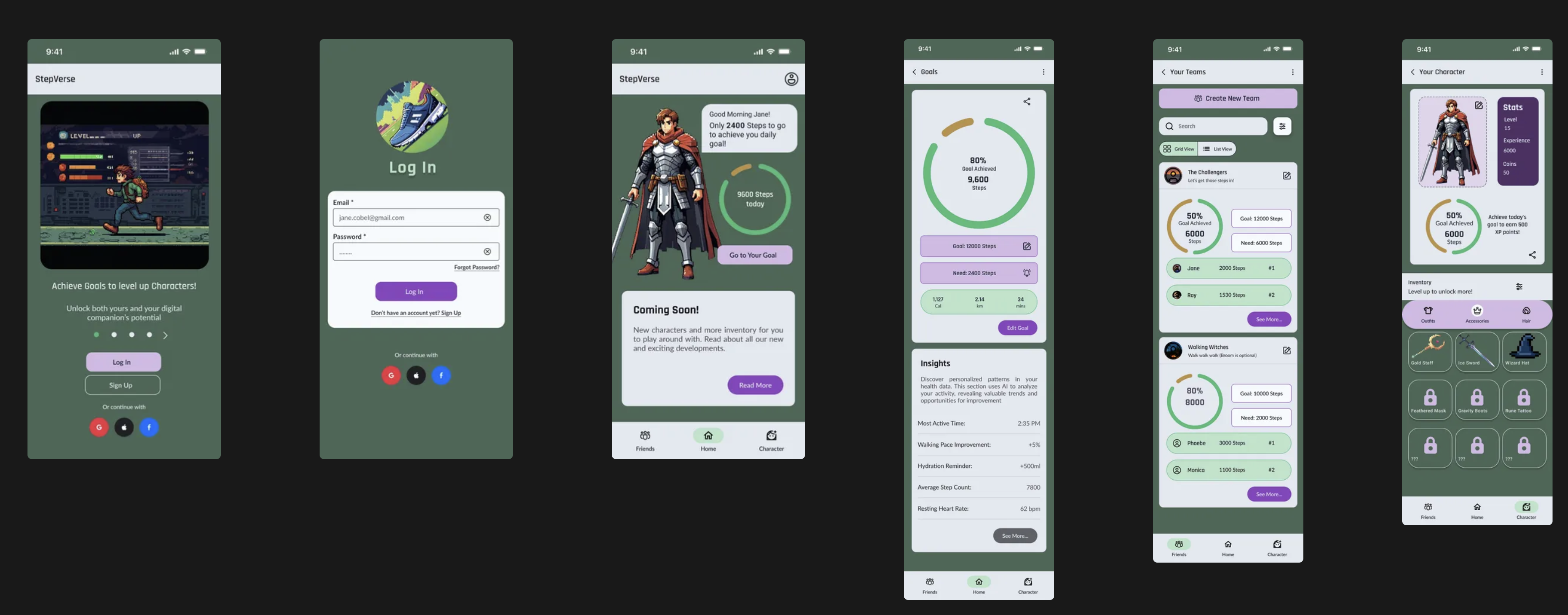
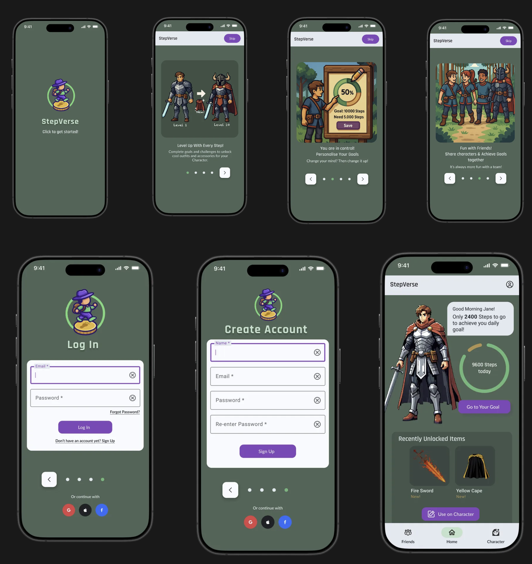
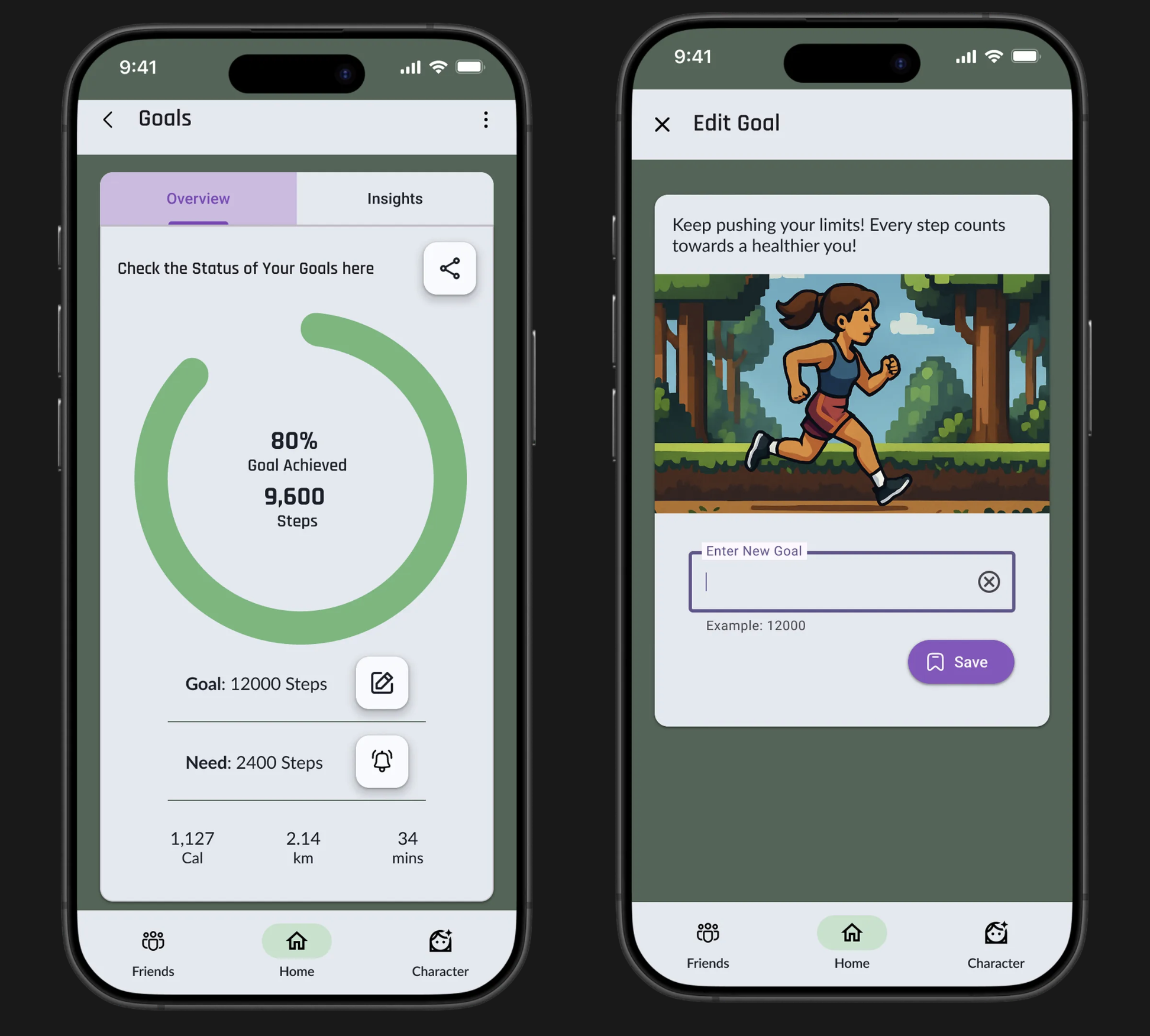
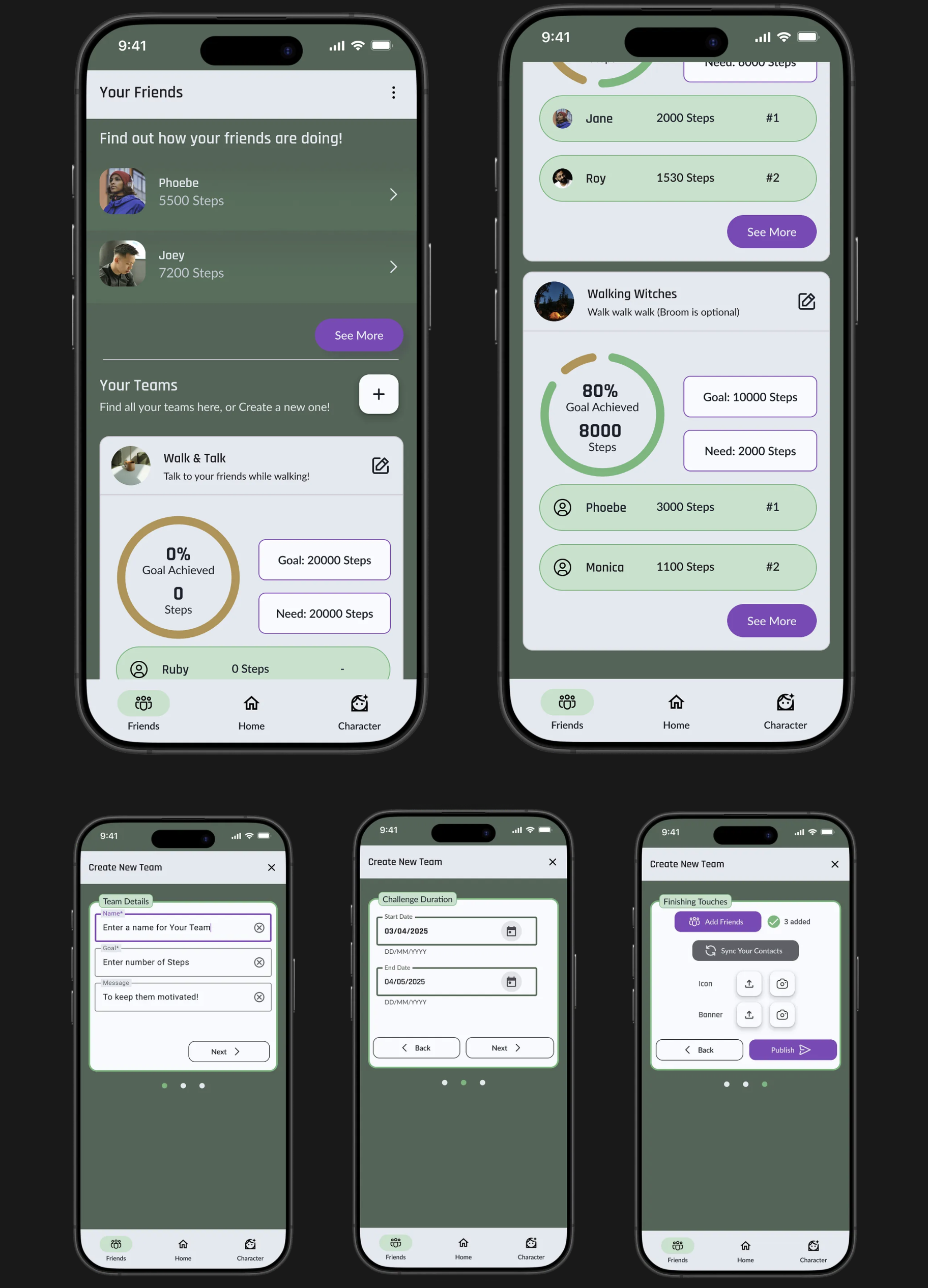
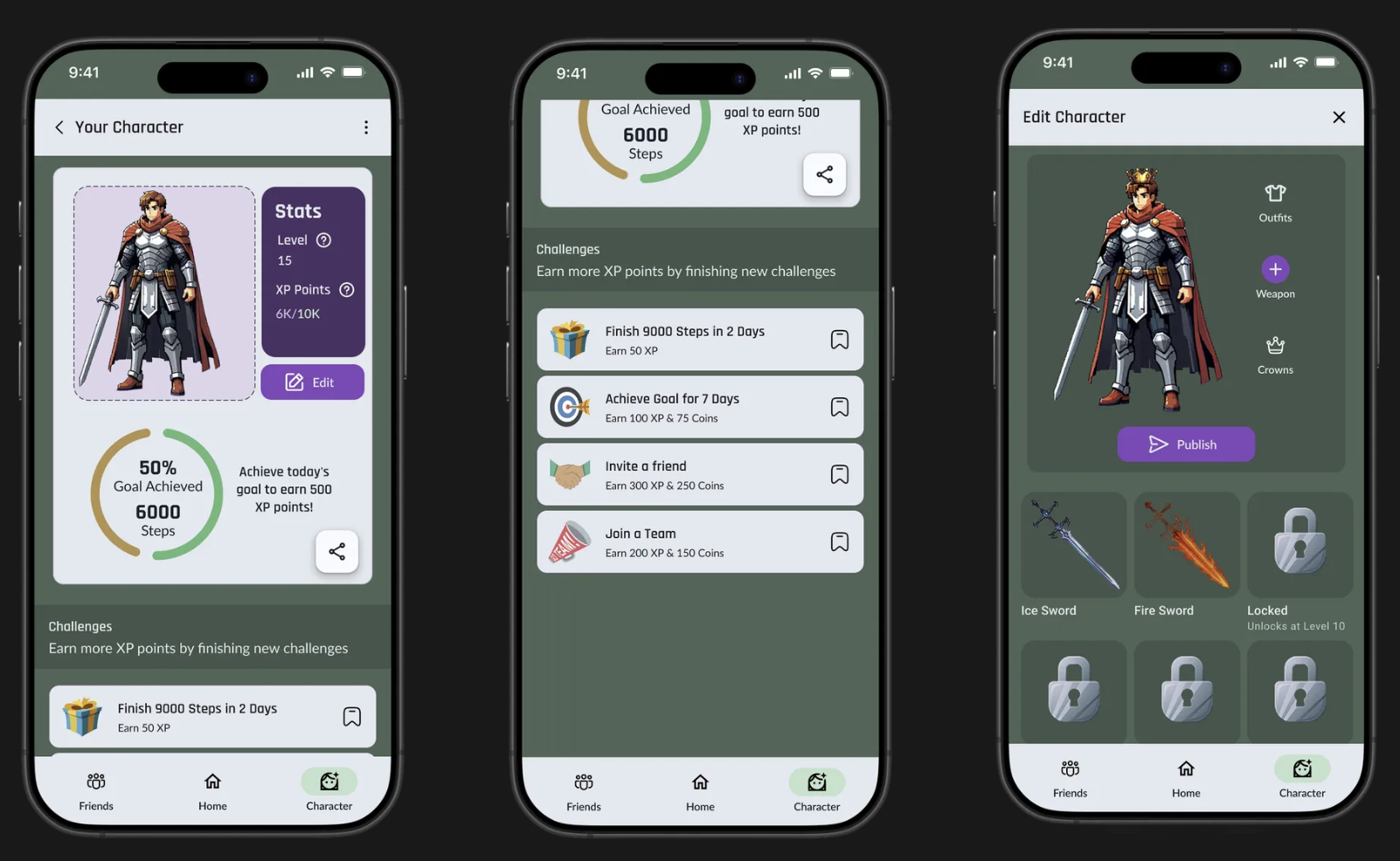
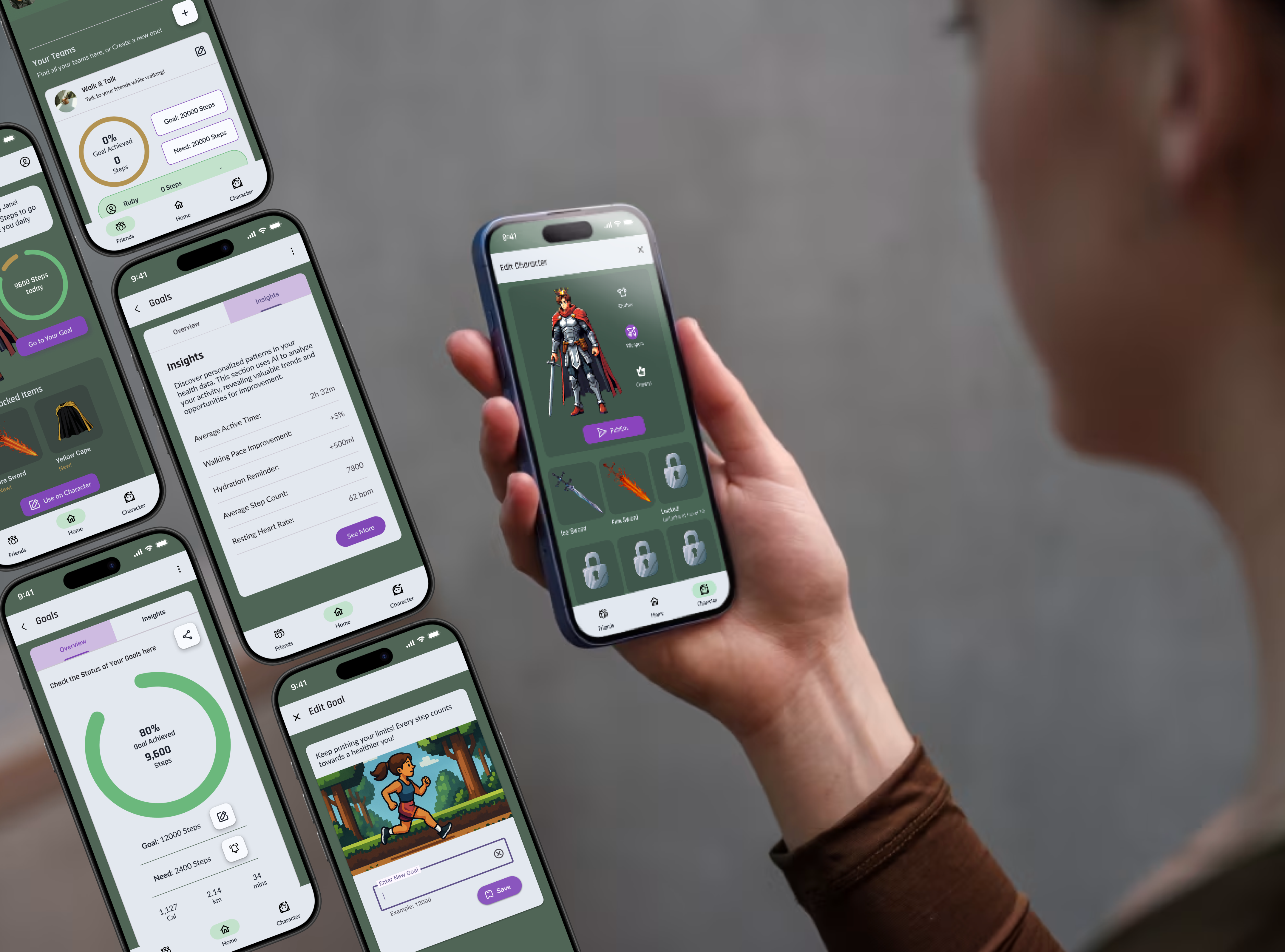
📱Final Mockups
After several rounds of iteration and refinement based on user feedback and design principles, here are the final mockups showcasing StepVerse’s core user experience. These designs aim to be intuitive, engaging, and visually appealing.
→ See the video demo below for a quick overview:
↗️ Youtube: StepVerse Prototype Walkthrough
1. Onboarding Flow
2. Goals Flow
3. Friends & Teams Flow
4. Character Flow
Explore the interactive prototype →
🚀 Future Plans
Design is an ongoing journey of learning and improvement! The insights gathered so far pave the way for exciting future developments for StepVerse. The next phase would focus on deepening engagement, unifying the gamification experience, and addressing usability enhancements with a positive, iterative mindset.
New Hypotheses to Explore:
- Varied Challenges: “If we introduce more diverse and clearly communicated challenges (beyond daily steps), users will engage more frequently and for longer, boosting motivation.”
- Actionable Insights: “If the ‘Insights’ section offers more personalized, actionable advice from user data, the app will become more valuable, encouraging positive behavior adjustments.”
- Engaging Teams: “If team creation and participation are more visually engaging with clearer team-based rewards linked to Character enhancements, users will be more inclined to form and participate in teams.”
Key Areas for Improvement & Growth:
- Dynamic Home Screen: Evolve the home screen beyond static info. Consider more dynamic content like active challenges, friend updates, or personalized tips to make better use of this prime real estate.
- Clearer Reward System: Make the connection between achieving goals, earning XP, and unlocking specific character inventory items more transparent and exciting within the Character and Inventory screens.
- Integrated Social Experience: Strengthen the link between the Character and the Friends/Goals sections. How can the character be a more visible part of the social experience to make features feel more cohesive and fun?
This iterative approach ensures StepVerse can continue to evolve, always striving to better meet user needs and make fitness a truly enjoyable part of their lives.
I hope you enjoyed exploring StepVerse! Happy to answer any questions.