Sophia - Website for an AI SaaS Product
A modern website for Sophia, an AI commitment system that helps teams stay aligned by tracking commitments, ownership, and execution drift.
About the Project
A great product needs a story to go with it. While designing the website for Sophia and working with Decontrol, I experienced firsthand how the product was being received and created the narrative that hooks people in.
Sophia is an AI commitment system for teams. The website needed to communicate a complex product idea in a simple, modern, and credible way.
Goal
“How do you explain the benefits of using Sophia to a team that already has so many tools to keep track of?”
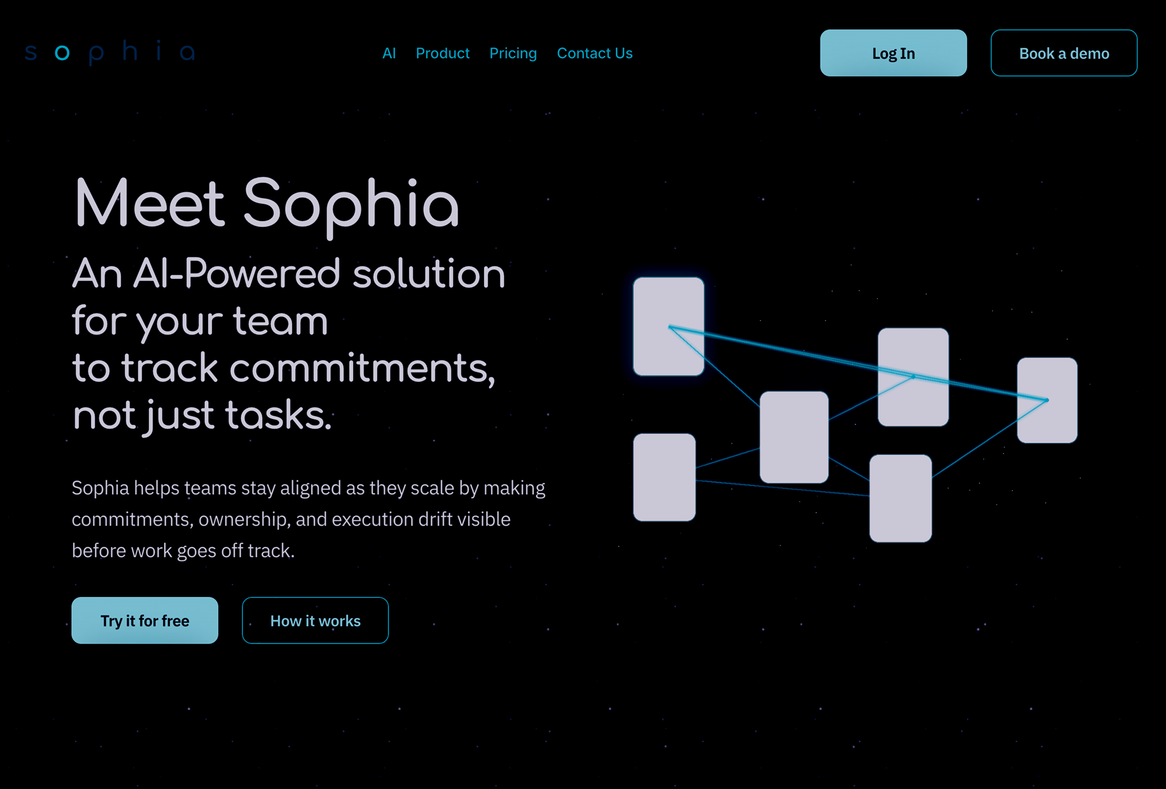
The goal was to create a modern website for Sophia, an AI commitment system for teams.
The challenge was to explain a complex problem in a simple flow while taking the user’s cognitive load into account.
Design Process
Research
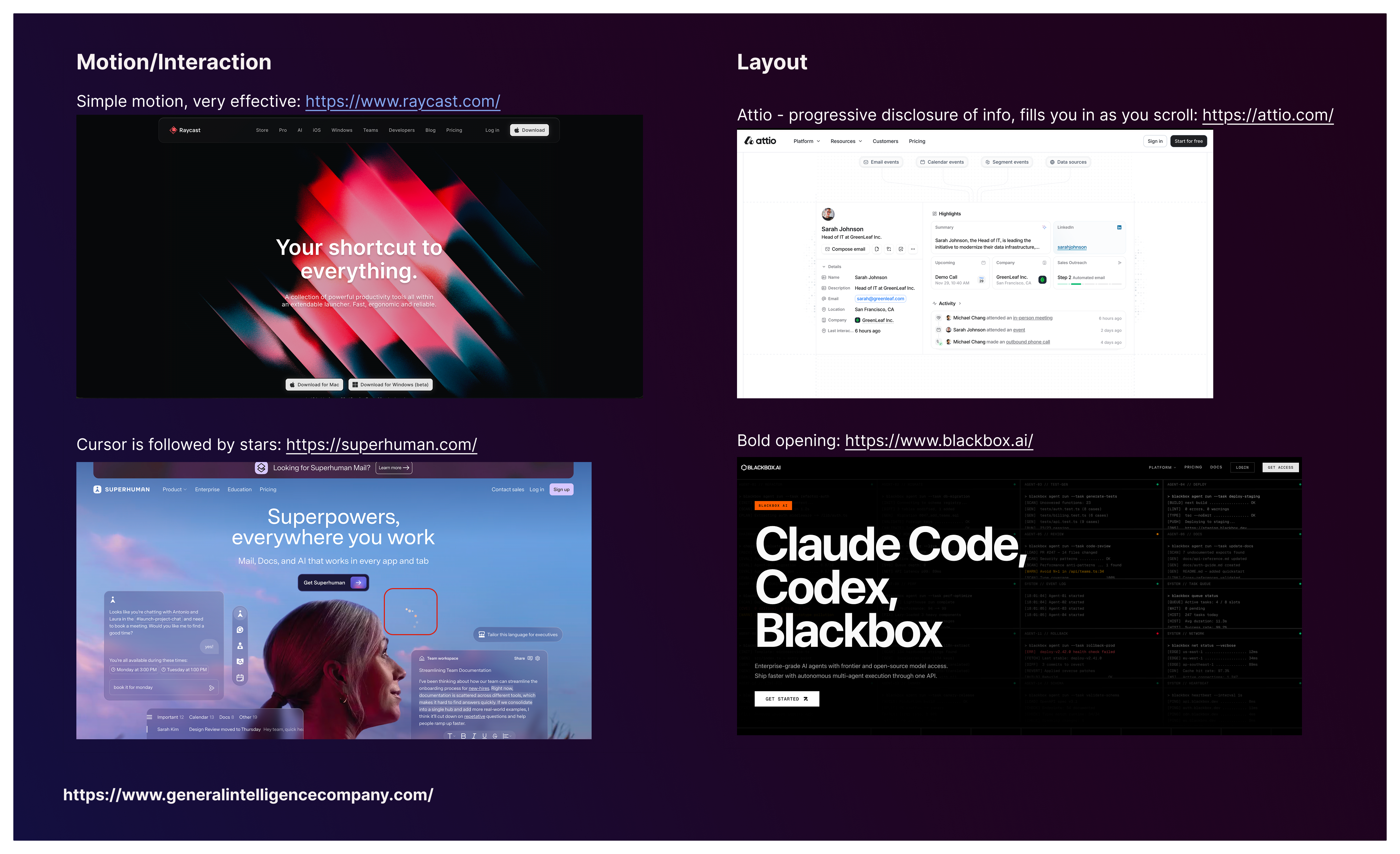
Understanding how the market currently promotes AI-forward SaaS products was crucial to helping the Sophia website stand out. Since the product is targeted toward businesses, the page also needed to feel sleek and clearly communicate the value proposition to decision-makers.
Direct competitors and adjacent tools such as Jira, Notion, and Raycast informed the information architecture. Visually, Sophia also had a gaming influence, along with a space-inspired, constellation-like structure. I used a space-themed opening to give the page a futuristic feel, which aligned with Sophia’s promise: a futuristic way of working.
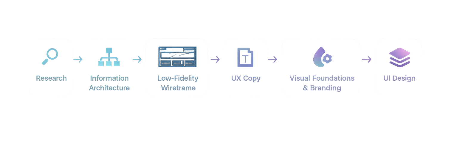
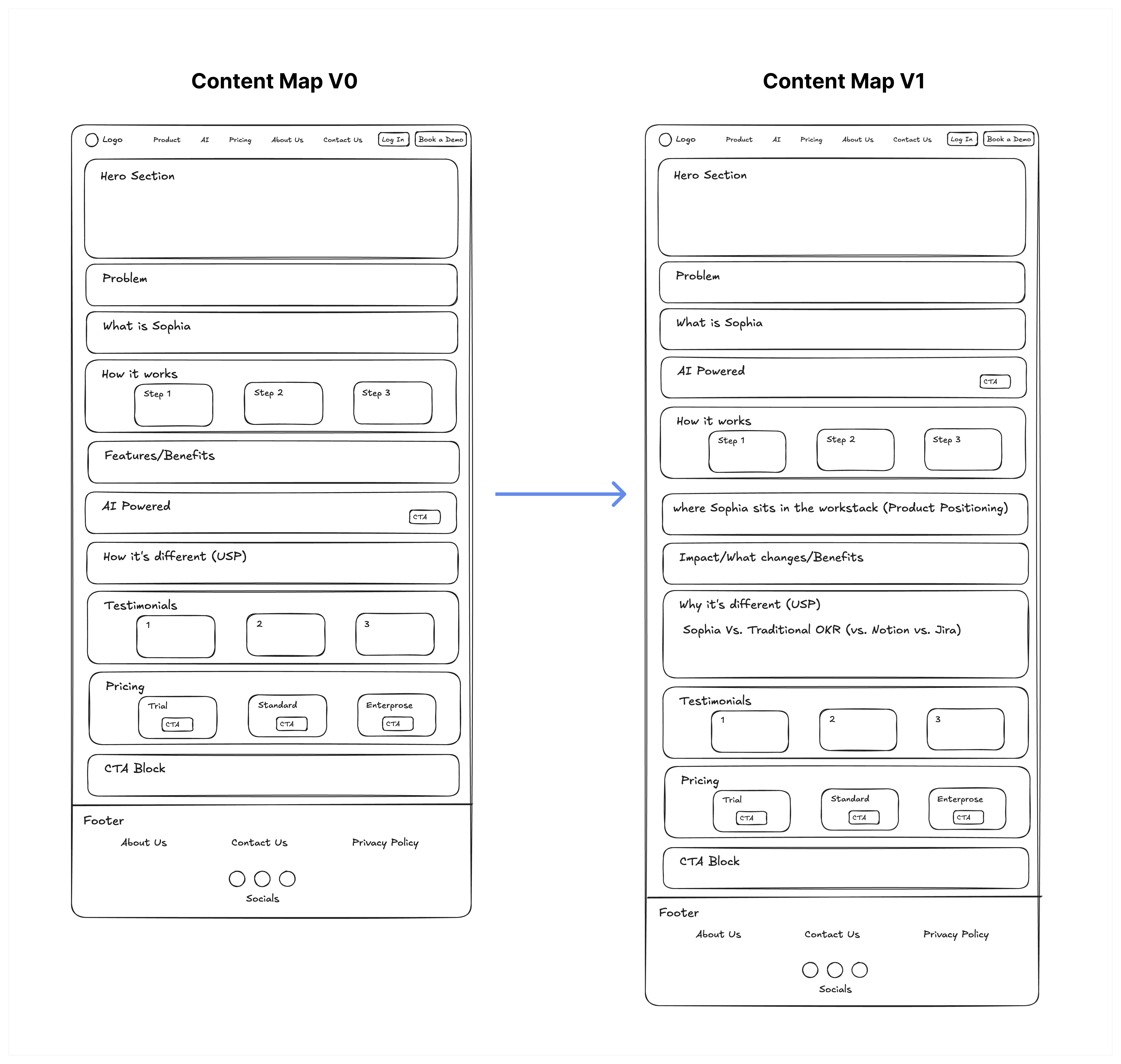
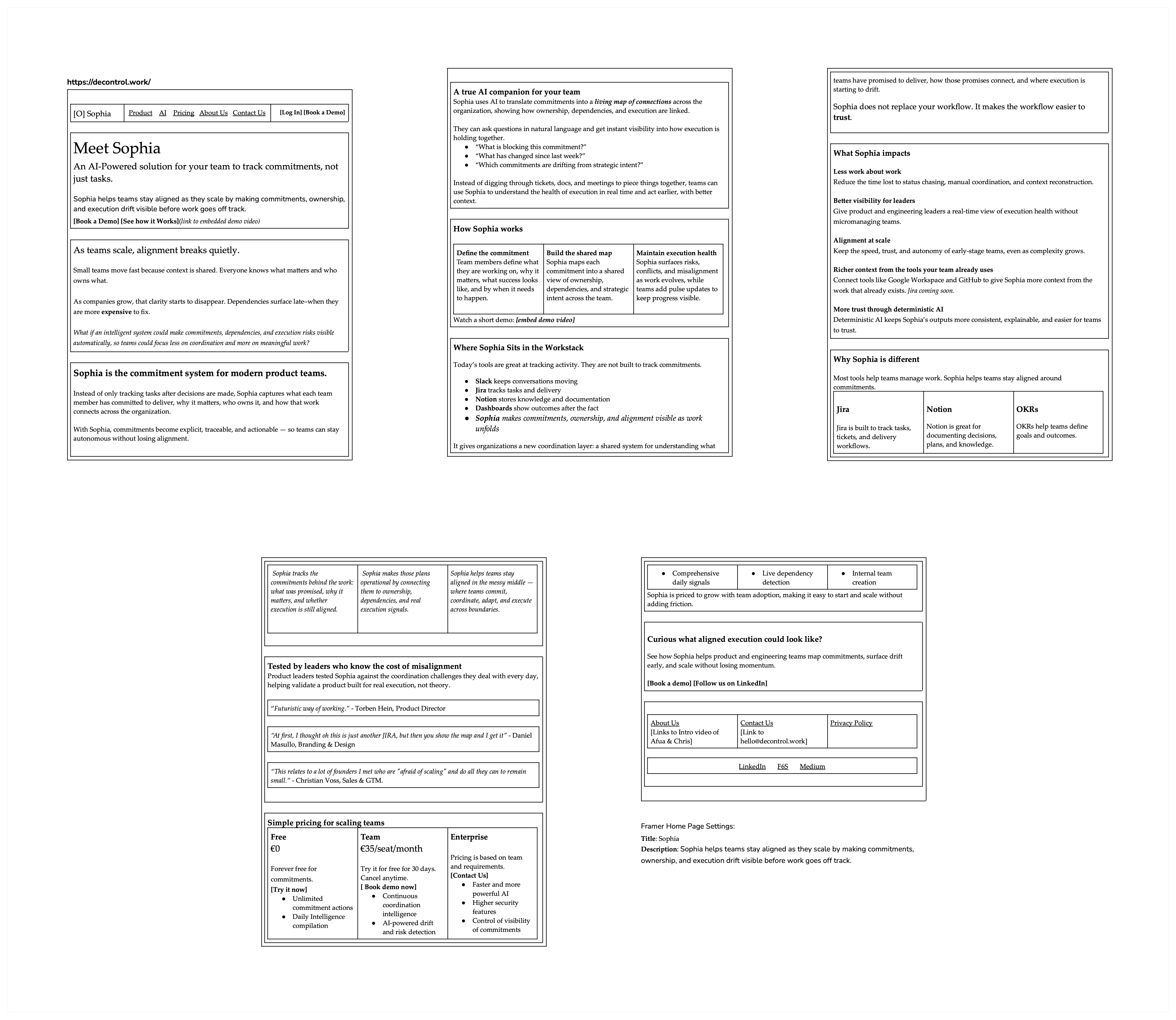
Low-Fidelity Wireframe / Content Map
To define the overarching structure, I sketched out a wireframe. The page was divided into short sections, each focused on what potential customers would care about most.
The first draft was reviewed with the stakeholders, and we discussed what needed to be added. This led to changes including a dedicated product positioning section and a stronger USP section.
This showed the importance of a simple content map and iterative design. Because the structure was still lightweight, changes were easy and quick to include.
UX Copy
A polished homepage is nothing without the actual content that informs potential users. Using the wireframe as a base, I drafted UX copy that shaped Sophia’s messaging.
It was important to clearly communicate:
- Whether the product replaces an existing tool or adds to the team’s workstack
- What the investment of the team’s resources gives them back
- What impact the product has on alignment, ownership, and execution
Trust in the product is as important as the MVP features. Testimonials play a key role in making potential customers interested enough to continue exploring.
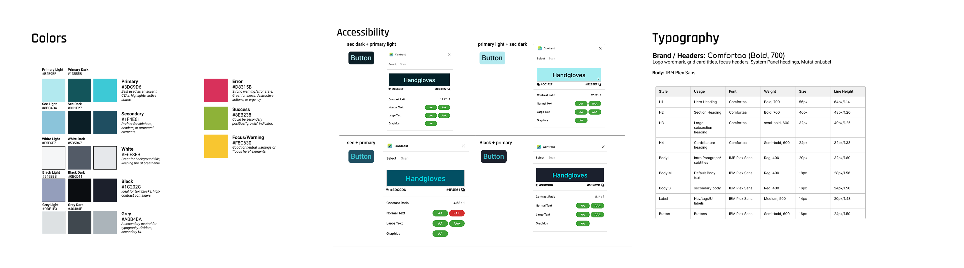
Colors & Typography
After the UX copy was finalized, it was time to move into Figma. I established the visual design, color system, and typography for Sophia. The visual direction tied into the starry theme while keeping the product distinctive.
This was also when I assessed accessibility by comparing contrast values across different color combinations and creating enough differentiation in font sizes to support a clear, pleasing, and easy-to-read visual hierarchy.
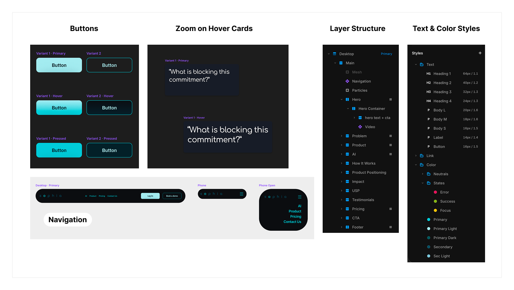
UI Kit / Framer Components
Making the design consistent meant using reusable components and styles. I established color and text styles, then created buttons with multiple states, different card types, and a responsive navigation bar.
These components helped keep the page consistent as the design moved from static layouts into Framer.
UI Design
Bringing everything together, I designed an uncluttered and modern website. I worked section by section, always keeping in mind how the user’s eye would move across the available information.
Breaking the page into focused chunks helped make the content easier to understand, while microinteractions added interest as users navigated the website.
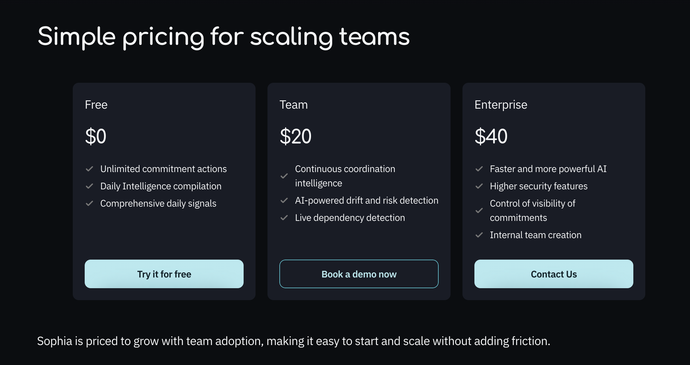
One of the most important sections in a SaaS website is pricing, so I took special care to make the wording easy to understand while clearly showing the value users would receive.
The design is responsive, and Framer’s built-in stack layout was used carefully so the page would not break if additional information needed to be added later.
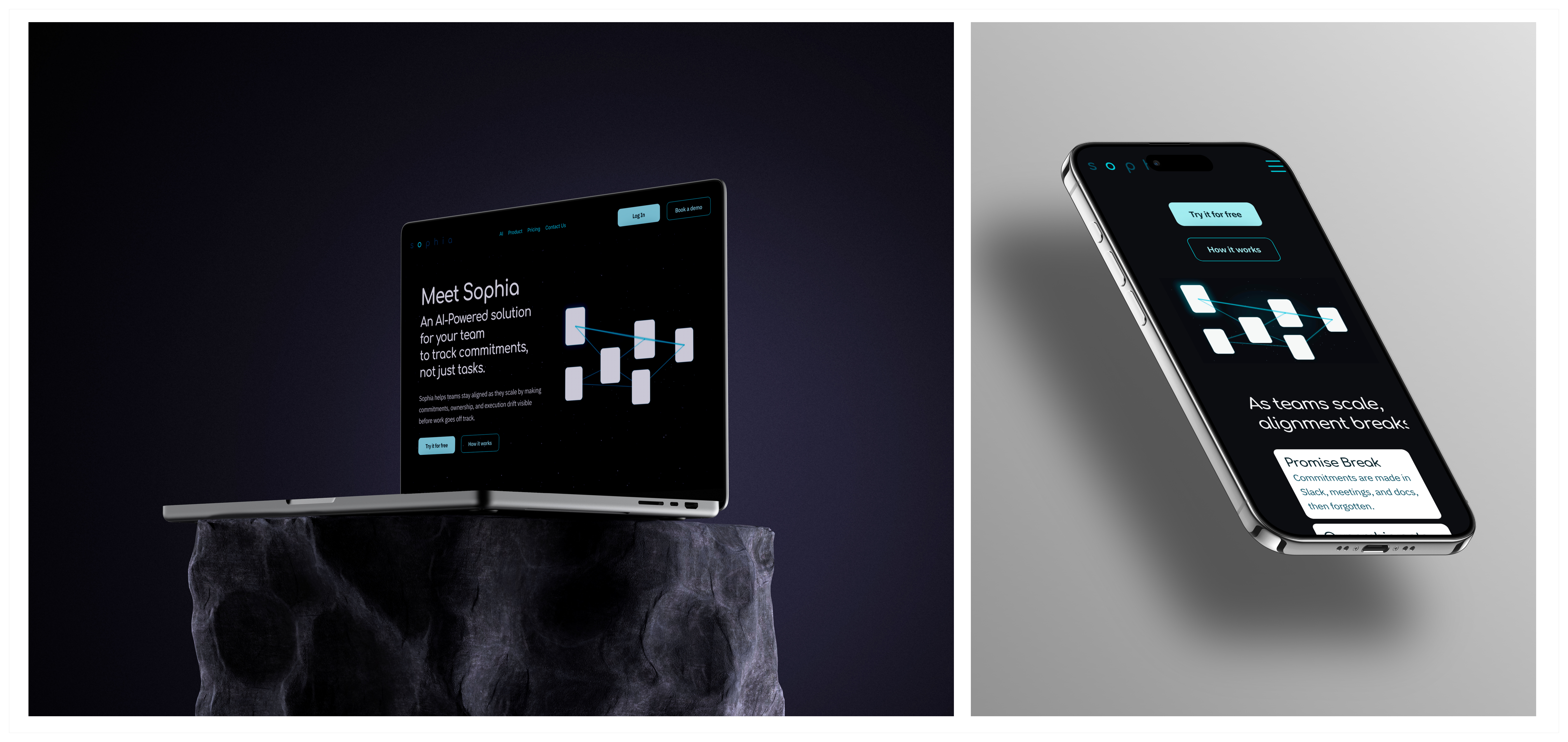
Outcome
The final outcome was a responsive Framer website that explains Sophia’s value proposition, differentiates it from existing tools, and guides users toward booking a demo.
Challenges & Learnings
There was a learning curve with Framer, especially around responsive design and its built-in layout structure. Once I got up to speed, I adapted quickly and used the layout system more intentionally.
Having a UX copy draft reviewed before jumping into design was an important step. It already suggested many design elements, such as where to break up content, which helped immensely when iterating with stakeholders before moving into visual design.
If I were to change anything, I would start with fewer card styles and expand them only as needed. That would give the design better cohesion from the beginning.
I would be happy to answer any questions you have.