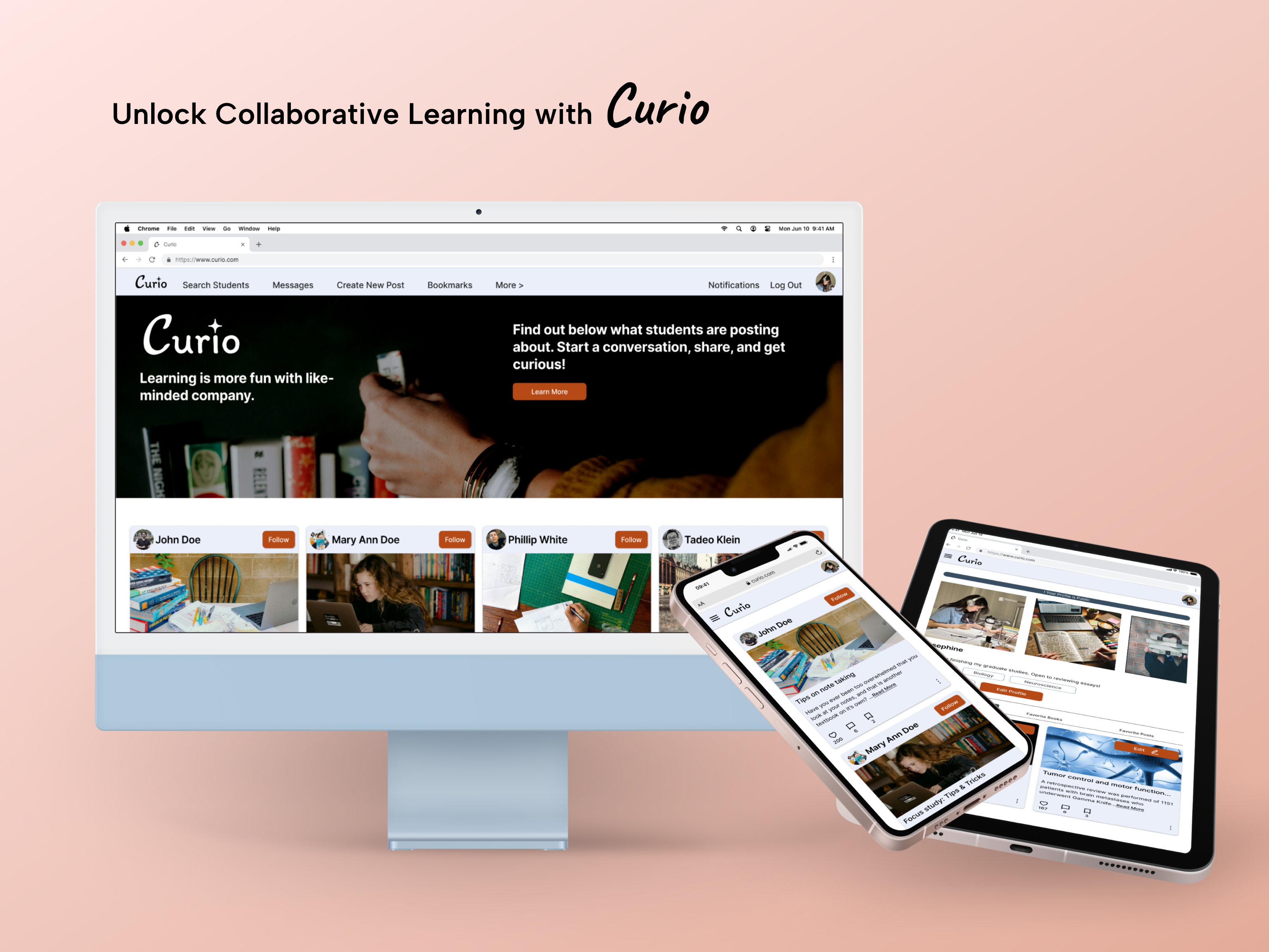
Curio - Unlock Collaborative Learning
A responsive web app designed to transform the online study experience from isolating to collaborative.
What if learning wasn’t a solitary journey, but a vibrant, collaborative adventure?
This was the vision behind Curio, a peer-to-peer learning network designed for the modern student. Over two months, I took this concept from a brief to a fully-realized, high-fidelity prototype, focusing on creating an experience that was both focused and community-driven.
The Challenge: Bridging the Gap in Online Education
In today’s digital education landscape, students often feel disconnected. While flexible, online learning can be isolating, leaving students without the immediate, relevant peer support found in traditional settings. They need a tool that fits into their busy lives and solves these key problems:
- Isolation: Difficulty connecting with peers for discussion, feedback, and collaboration.
- Motivation: Lack of a shared community to maintain enthusiasm and engagement.
- Inefficiency: Trouble finding relevant study materials and advice from fellow students who have walked the same path.
The goal was clear:
Design a digital space where students could connect, share, and grow together, fostering a sense of community, curiosity, and focus.
Establishing the Vision: A Brand Built for Focus & Community
I established a clear brand identity to guide every design decision. The story of Curio needed to be told through its visuals as much as through its function—it had to feel like a calm, intellectual, and supportive space.
The Mood: Grounded & Studious
I explored several visual directions, ultimately choosing a mood that felt warm, approachable, and intellectual. The aesthetic reminds of a classic library or a comfortable study group, creating an environment that feels safe and non- intimidating for peer-to-peer feedback.
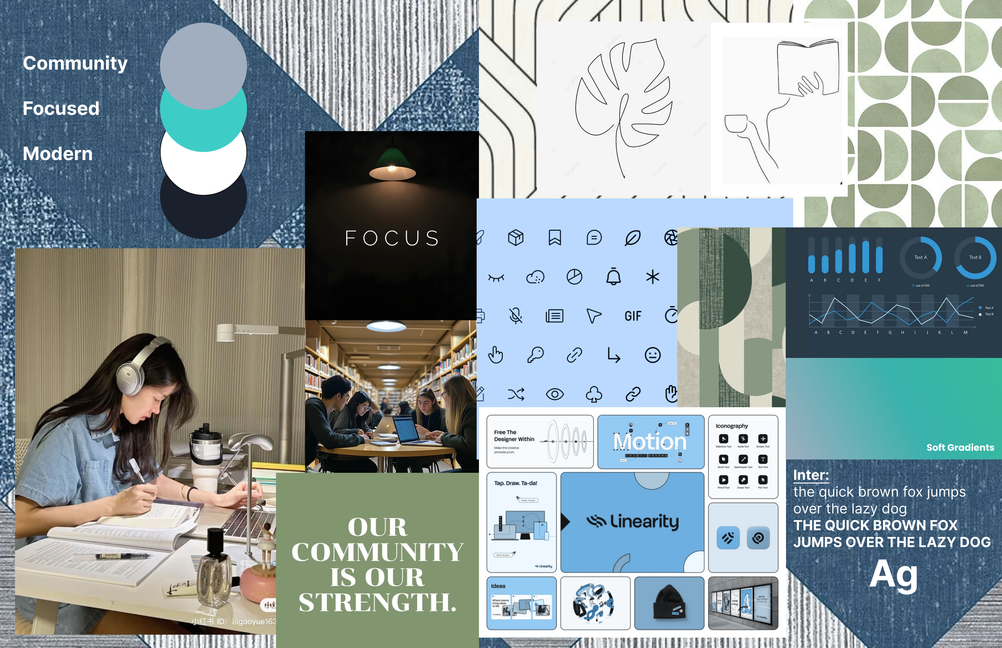
The Color Palette: Warmth and Clarity
The “Grounded & Studious” mood was translated into a color palette that is both calming and clear. An earthy, stable brown serves as the primary action color, while a dusty, focused blue is used for secondary elements and active states. This combination is perfect for fostering a welcoming and supportive community. It was applied to a few mid-fidelity wireframes to confirm it works:
The Process: From Rough Ideas to a Refined Experience
My design process was iterative and user-centric, ensuring that every decision was grounded in established design principles. For examples, Gestalt principles were followed to ensure that the final design is perceived as intended.
Failing Fast: Low-Fidelity & User Flows
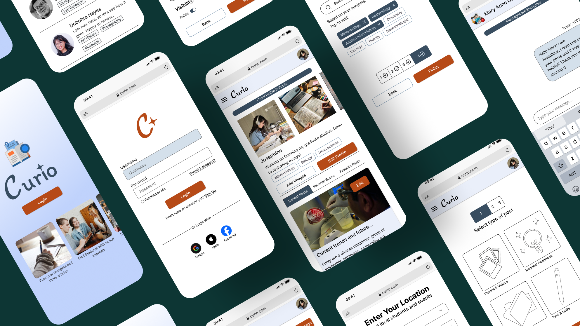
I believe in the principle of failing early to learn quickly. I began with simple paper sketches and low-fidelity wireframes in Balsamiq to map out the critical user journeys for onboarding, finding peers, and creating posts. This allowed me to test the core logic and flow of the app rapidly and cheaply, without getting attached to polished visuals.
 I translated the initial user stories into a tangible user flow, so that the foundational navigation was intuitive before moving into higher fidelity.
Foundations of an Intuitive UI: Applying Design Principles
With the core flow validated, I moved to mid-fidelity wireframes, focusing on creating a clear and intuitive interface by applying core visual design principles.
- Visual Hierarchy: I established a clear typographic scale using the “Inter” typeface to differentiate headings, body text, and interactive elements. This guides the user’s eye naturally through the content.
- The Principle of Proximity: To make the interface easy to scan, I applied this Gestalt principle by grouping related items. For example, the like, comment, and save icons on a post are placed close together to form a clear, cohesive action bar.
Building a Scalable Component Library
To ensure consistency and efficiency, I developed a comprehensive component library in Figma. This system includes all core UI elements, from buttons and input fields to the post cards that form the heart of the app. Each component was designed with different states (default, hover, disabled) to create a predictable and responsive user experience.
This systematic approach doesn’t just make the design process faster; it creates a robust foundation for future development and scaling.
Deep Dive: View the Full Style Guide
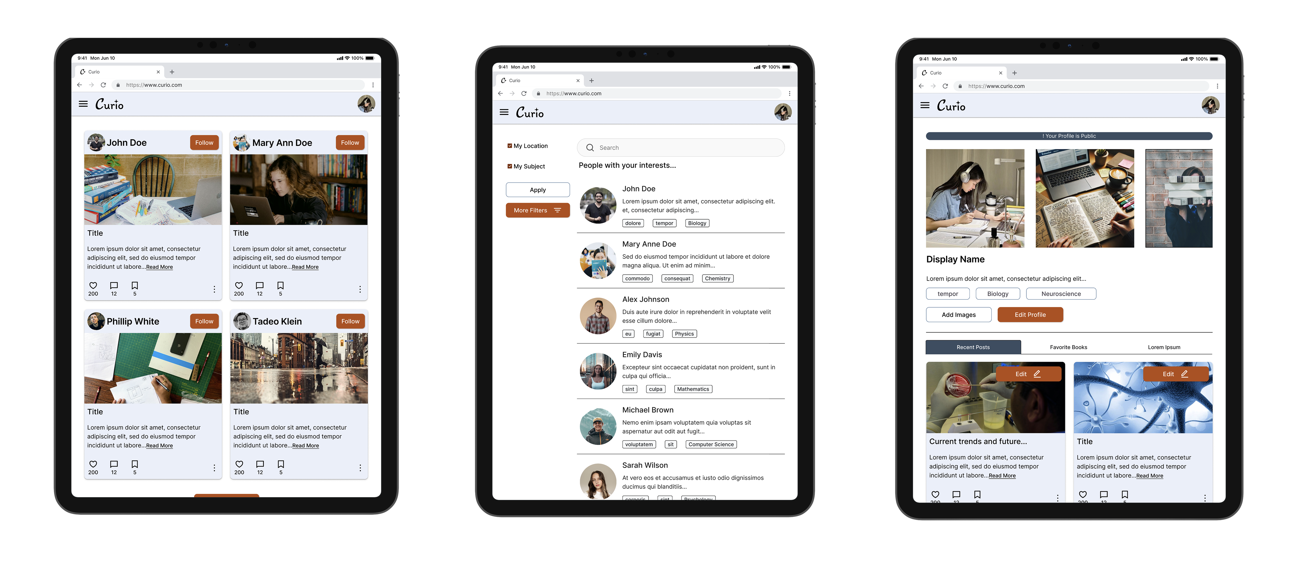
Designing for Every Device: A Responsive System
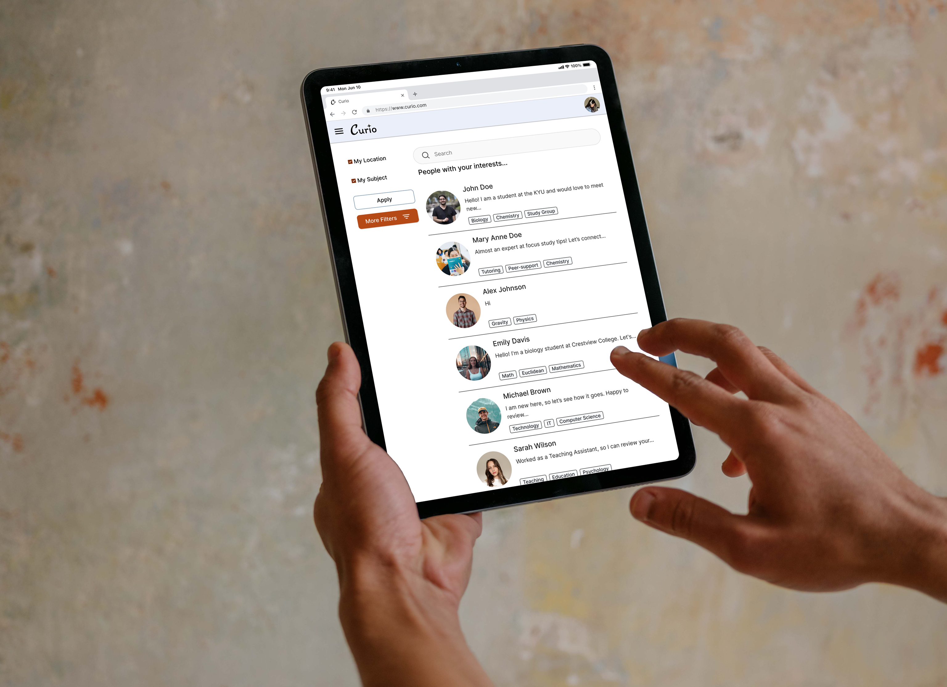
Recognizing that students learn anywhere, Curio was designed with a mobile-first, responsive approach. The layout gracefully adapts from a single-column mobile view to multi-column layouts on tablet and desktop, ensuring a seamless experience on any device. On desktop, the design utilizes the extra space to introduce a sidebar for filtering options and a full navigation bar, applying the principle of progressive enhancement to make the experience more powerful without cluttering the mobile view.
Bringing it to Life: Motion
A great UI isn’t just static; it feels alive and responsive.
Considerations for Motion
Motion was used purposefully in Curio to enhance the user experience, not distract from it. The animation principles were:
- Provide Feedback: A subtle loading animation hides publishing time, and a success checkmark provides satisfying confirmation.
- Guide Focus: Page transitions slide in directionally, creating a clear sense of spatial navigation for the user.
Usability Testing: Evaluate & Evolve
A crucial step in my process was conducting a usability test with a participant who, like our persona, had experience with online learning and peer review platforms like Coursera. This session provided invaluable feedback, reinforcing successes and highlighting areas for improvement.
Key Positive Feedback:
- The overall aesthetic was praised for its simplicity, sincerity, and minimalist design, effectively conveying a serious yet engaging study environment.
- The animations, particularly on the splash screen, were well-received and appreciated.
- The standard format for texting was found to be very smooth and helpful.
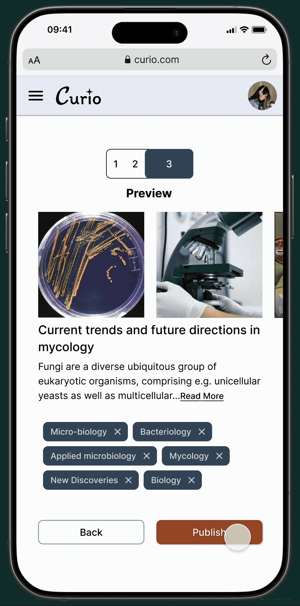
- The three-step progress indicator for post creation was considered very helpful, clearly showing the user how many steps were involved.
Areas for Improvement (and how they will inform future iterations):
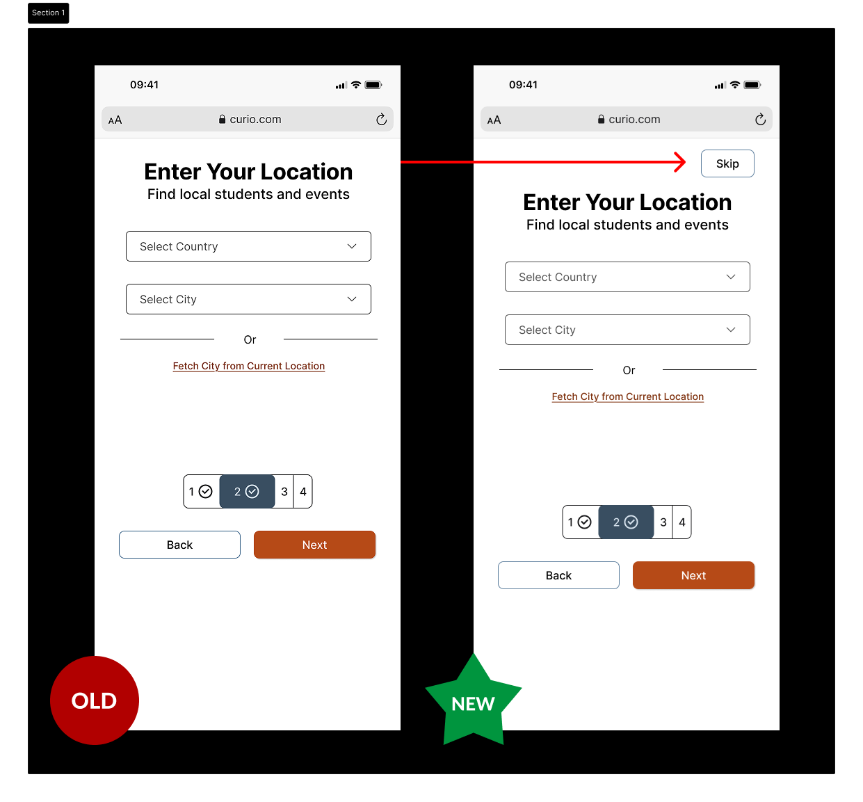
Onboarding Clarity: The participant found mandatory fields (location, specialization) potentially intrusive for initial exploration, suggesting a need to clarify which fields can be skipped.
- Action: Introduce asterisks for mandatory fields and add ‘skip’ button. This also aligns with accessibility guideline WCAG 2.4.1 “Bypass Blocks”.
Discoverability of Core Features: Both “Search Students” and “Create New Post” were found to be somewhat hidden within the menu, despite being primary tasks.
- Action: Explore bringing these key functionalities to a more prominent, intuitive location on the home screen, possibly with a floating action button for “Create New Post” as suggested by the participant.
A Foundation for Future Growth
Designing Curio was a journey in creating a focused, supportive, and beautiful digital space for learning. The final result is a high-fidelity prototype that solves the core problem of isolation in online education by putting community and collaboration first.
Curio’s future includes a robust accessibility audit, so the resulting improvements would benefit multiple users and adhere to WCAG. I also plan to bridge the gap between design and engineering, by coding a few key screens of the application. This would ensure a smooth handoff with developers and also aid in an in-depth usability testing.
Interact with the Final Prototype →
I hope you enjoyed exploring Curio! Happy to answer any questions.